Inky Embossing - Three Ways
with Gina K Designs
A few days ago I watched a live that Jennifer and Gina did together. (You can see it here.) They were using a new 3D embossing folder that I don’t have, but they did inspire me to pull out this 3D Contemporary Flower embossing folder that I got but (in the busy of late summer) hadn’t used yet.
My challenge:
I was trying out the background inking technique, that I previously have not had great success with. Perhaps because my foam ink pads don’t work as well for it, but whether that’s the case or not, I decided it was time to practice it more.
Because I’d had a hard time getting a smooth inking, I decided to just embrace that and go for more of an artistic painted look. I used some ink cubes from Gina K to try the technique with felt ink pads instead of the foam.
I also found that when I ran it through the embossing folder more than once, the paper either stretched or shifted and I got some shadow printing. I tried some techniques on my cards to try to minimize how obvious that is. See what you think…
Techniques:
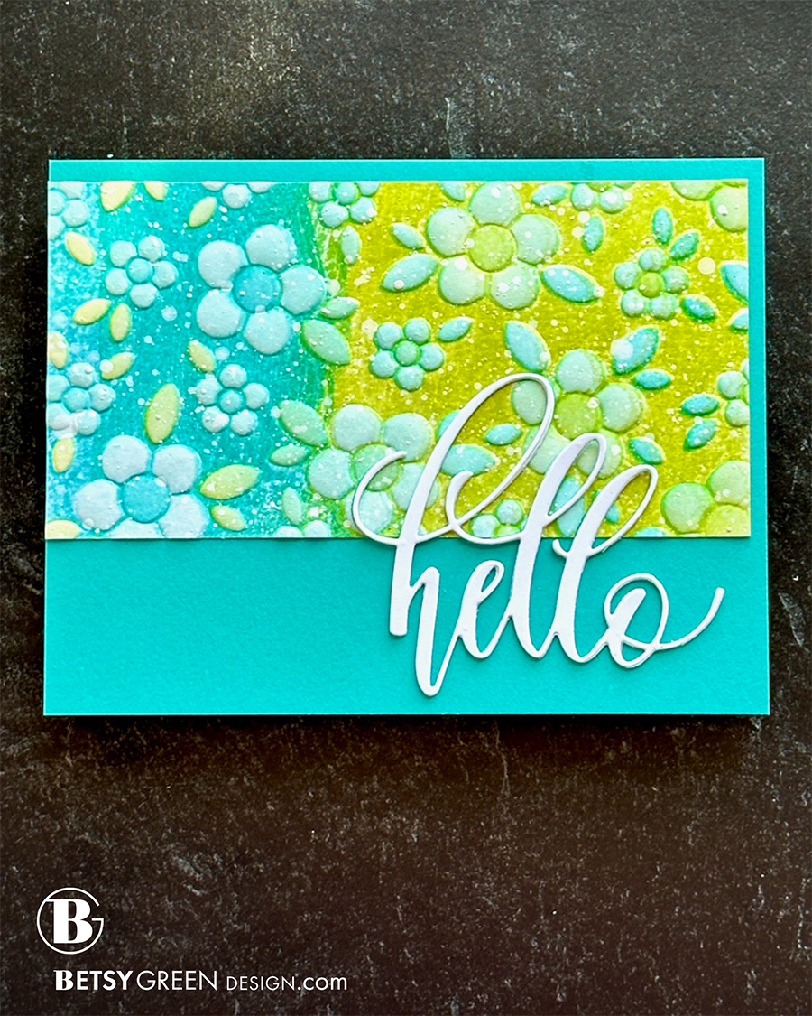
I wasn’t sure what colors to use on the flowers after inking and embossing the panel. For this version, I stayed with the same three ink colors I’d used on the background.
I ink blended the raised areas with lighter versions of the background colors, and used the green on the flowers in the blue area and vice versa.
After doing that, I decided it felt too plain, so I did some water and white splatter on it to create a pattern of texture on it. Adding it to a coordinated color base grounded it.
I paired it with a stacked die cut greeting, in a bright white that contrasted against the bright colored background and panel.
Colors:
ink: Gina K Designs Key Lime, Emerald Coast, Blue Lagoon.

Techniques:
Same technique as outlined above to create the blue-green background.
This time I used different colors through the flower stencils.
I used Butterscotch on the flower centers.
Then switched to the full bloom stencil and did that in the Passionate Pink. (It created a great coral color where it overlapped the Butterscotch.)
I then went in with a detail brush and added ink blending on some of the leaves in the ink color to match that section of background. I intentionally left some leaves white, but leaving all of them white made it a more busy pattern and took some of the focus away from the colored flowers.
A coordinating cardstock circle was the perfect focal point for the greeting I used. I embossed it in white. (Which created the repetition and continuity of white on three layers - the greeting, the leaves, and the thin white mat of the base.) The scale of that circle makes a difference, too. I intentionally chose a circle for it that was larger than the flowers. Anything smaller (too close in size to the flowers and leaves) didn’t stand out as well. The contrast of scale, dimension, and color against the background all work together to create that focal point I wanted.
Colors:
ink: Gina K Designs Passionate Pink, Butterscotch, Key Lime, Emerald Coast, Blue Lagoon.

Techniques:
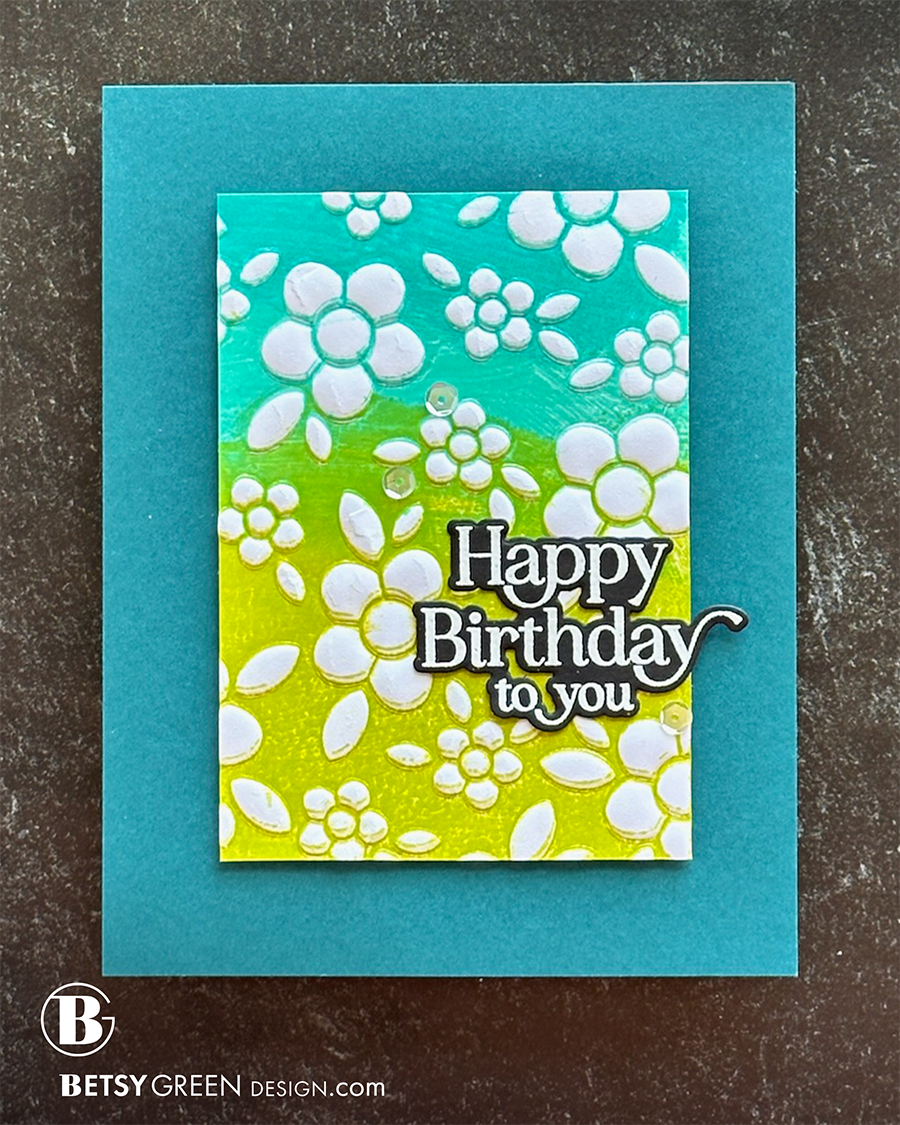
Same technique as the other cards to create the blue-green background.
This timeI left all the embossed areas white.
I cropped my panel down to allow space for a wide frame of the background color around it. Choosing a background color that is a deeper shade of a color used in the “art” adds dimension and depth, and keeps the focus on the brighter colored pattern. I attached the embossed panel with foam tape to enhance that dimension.
This card uses the same greeting as card 2, but I used the coordinating die to cut it out instead of stamping it on a shape. The background is smaller here, since I cropped it down, and is more simple with only the background color. Creating the black and white greeting gives it good contrast to stand out, and it didn't need help from size or dimension to do so.
Colors:
ink: Gina K Designs Key Lime, Emerald Coast, Blue Lagoon.
Thank you for visiting! I hope you get some time to create something soon.
Links are below if you’re interested in any of the products I used.

*Affiliate links do not cost you any more when you shop, but it is beneficial to creators when you use them, so thanks in advance!