Cover Die: Deconstructed
One of the things that caught my eye from the newest Simon Says Stamp release was a cover die. Here are a few cards made with it, and I’ve tried to come up with a couple of unique ways to use it.
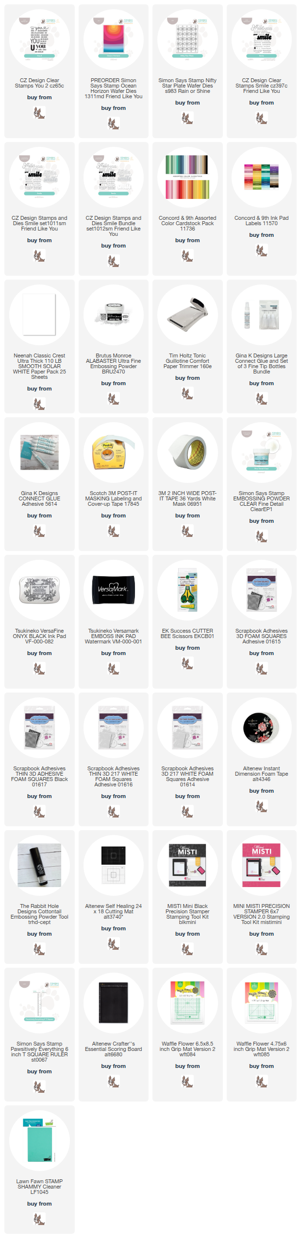
The products used on this card are listed below, but you can take a look at the complete new release from Simon Says Stamp HERE!


Approach:
For the release, I created one card using the whole die, and had some pieces left over that I started playing with.
I’ve also seen a lot of amazing cards with this die and wanted to try using it in a way I hadn’t seen it shared already. You’ll see those two cards below.

Techniques:
I had some die cut pieces left from another card, and noticed the shapes of the loop/rainbow pieces and wanted to make a card featuring those.
Selecting a background that’s a deep and saturated color allows the contrast of those bright white shapes to really stand out.
As I arranged the shapes, I left an open area to allow plenty of space for the greeting to fit without looking squeezed in. I also like to be sure that the white space left between the elements has a nice flow. Shapes that appear forced or squeezed in too tightly can have an awkward tension that isn’t what I wanted, and leaving too must space between can leave some elements looking disconnected.
The three loop elements also help lead your eye to the focal point area of the sentiment. (The sentiment is embossed with metallic Platinum embossing powder so that touch of shine helps it stand out.)
Adding the fun asterisk shapes from another cover die adds some elements at a smaller scale and some color interest. They also add to the flow of the layout, and playfully help the parts all feel connected.
Colors:
cardstock: Concord & 9th Plumberry, Watermelon, Dragonfruit, Sweet Pea. White.


Techniques:
This card uses the cover plate die, but rotated sideways. I cut off one end so it is mostly square and fits within the width of this A4 card panel.
I balanced the lighter colors (pink and white) with the deeper orange color to create some pattern and variation that highlights the shapes. That contrast between the color values also adds energy to the design.
The greeting is simply stamped and embossed in white. I chose to only use two lines of that stamp rather than the whole thing, so I taped off the other line while inking it. (Just remember to remove that tape mask before stamping!)
I attached the graphic to the card base with foam tape, to create the shadow and dimension around it.
Colors:
cardstock: Concord & 9th Pink Lemonade, Clementine. White.
Thank you for visiting!
Do you like learning how design principles are at work in my card design? Let me know, so I know
Links are below if you’re interested in any of the products I used.
*Affiliate links do not cost you any more when you shop, but it is beneficial to creators when you use them, so thanks in advance!
