Using Geometric Backgrounds for Pattern & Dimension
Featuring dies and embossing folders from Simon Says Stamp
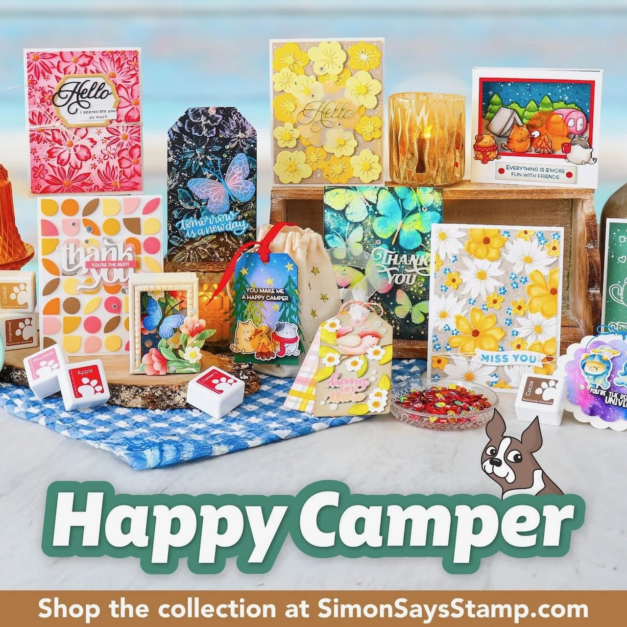
The Happy Camper release includes some cover dies and embossing folders that are very geometric - which made me so happy to see. You can take a look at the complete new release from Simon Says Stamp HERE! This post features some of those, and some of the cards I made with them.

Techniques:
This inlay cover die is definitely a style I like. Geometrics and mid-century modern styles always get my interest. Using just the frame of it over a solid background is one of the easiest ways to use it. For this card, I layered it on top of a solid panel in the same color of cardstock. I wanted the interest from the texture and the shadow, but I wanted it to say low-contrast so the flowers and greeting could be the focal point.
The starburst detail pieces on these flowers also feel a bit mid-century to me, so the pairing of the two dies has a style continuity.
I chose two bright colors and white for the flowers, so they’d be bright and have good contrast against the background. The energy of the colors I chose fits the playful style of the flowers.
This Thank You greeting has some flared curves that repeat some of the curves in the background. Keeping an eye out for those things with repetition or continuity help keep a design cohesive.
Adding foam adhesive to the back of some of the flowers continues the dimensional variation created by the background layers, and adds to the interest on the card.
Colors:
cardstock: Concord & 9th Sweet Pea, Starfruit, Lakefront. White.


Techniques:
This card features another geometric pattern with mid-century flair, but this time it is with the Demilune 3D embossing folder.
After embossing, I trimmed it to about 3.25”wide, so it didn’t cover the full width of this A2 card panel. I layered it over a blue card base.
I chose a few colors to cut the Fun Birdie dies from (yes, that die set is actually called Fun Birdies). If you look closely, you’ll see I used one yellow and one coral color for the two, but used them in different places. The third color on each is a blue, and for each bird it is the alternate blue to the background it is on. The bird on the aqua background has the more primary blue body. The bird on the primary blue background has the aqua wing. The limited color palette helps the card design feel cohesive, even though we have a few different element styles here. Attaching the birds with foam adhesive adds even more texture to the geometric textured background.
The black and white script greeting has good color contrast, and the curvy lines tie in well with the birdie shapes - and the background a bit as well.
Colors:
cardstock: Concord & 9th Sorbet, Sunflower, Aqua Sky, Blueberry. White.


Techniques:
This card also features the Demilune 3D embossing folder. This time I made it a “short” (which is actually more narrow) front panel that reveals a pattern on the edge of the inside.
To show off the embossed pattern and texture, I swiped an Interference ink pad across the embossed panel. That creates a color shift on the most raised surfaces. When viewed straight on the ink looks more blue, but move it at an angle and you see the gold shine!
I accented the card with some Groovy Flowers die cuts and sequin embellishments to break up the background pattern. Believe it or not, the yellow strip on the inside panel is a scrap from cutting the flower centers. (Though I did cut them in a row intentionally so I could use it for something. I thought the negative shape left from the die was fun as well.
Colors:
cardstock: Concord & 9th Sweet Pea, Starfruit, Lakefront. White.
ink: Lisa Horton Cloud 9 Interference Ink Sapphire Gold Shimmer


Techniques:
These next two cards feature the Dual Diamonds wafer die. It provides a lot of options since it includes both a diamond outline (that’s a lot like a lattice pattern) and inlay pieces.
For this card, I used it all - the outline frame and the inlay pieces, but I cut it from 5 colors of cardstock. (Some colors I just did a partial cut on scraps, not the whole plate, because I just needed some for inlay. The dark blue is the only one that had to have a complete panel.)
After creating the whole card panel of pattern that I was happy with, I ended up covering part of it with a dark blue band because I felt the greeting needed a more solid foundation.
I added a few diamond pieces in navy only on the navy cardstock band, which fit within the grid of the background and add a little bit of low-contrast dimensional interest to the greeting band.
I decided to spray the whole background with a sparkle spray, so I used Post-It tape to mask off the greeting band when I did that.
Colors:
cardstock: Concord & 9th Pink Lemonade, Sorbet, Clover, Juniper, Midnight. White.

Techniques:
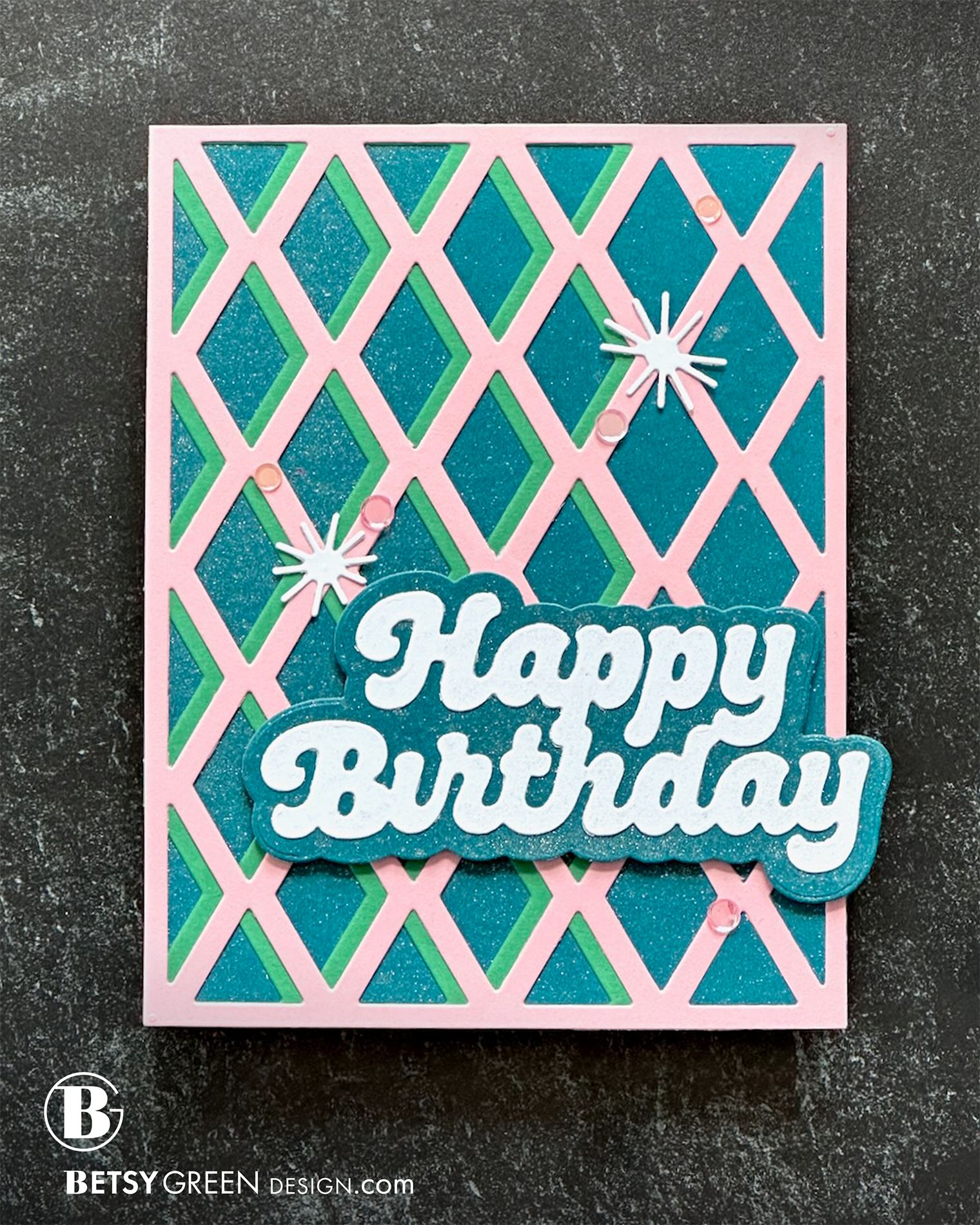
This card features just the outline/frame portion of the Dual Diamonds wafer die. I used a full panel of it in pink, and a partial panel of green to add some offset interest.
Before I attached those layers together, I sprayed the Teal card base with a sparkle spray, for extra fun peeking through the openings. I added the same sparkle to the greeting on the front.
The little white starbursts are the centers from the Groovy Flowers dies. I like them as flower centers, but am also having a lot of fun using those on their own.
Colors:
cardstock: Concord & 9th Pink Lemonade, Clover, Peacock. White.

Thank you for visiting!
Links are below if you’re interested in any of the products I used.
Supply list*:
(Listed by company, with links to Simon Says Stamp and others. Simon Says Stamp links are affiliate links*.)
*Affiliate links do not cost you any more when you shop, but it is beneficial to creators when you use them, so thanks in advance!