Fun Accordion Scene Cards
August 2025 Release from Concord & 9th
The Accordion Card Base Dies are part of the Concord & 9th release. Yes, you can create accordion cards on your own, and I have, but these dies make it so easy and everything is perfectly scored to fit just right. These accordion cards are so good because they have so much depth and dimension, stand up on their own, yet easily flatten to fit in an envelope. While I’ve only made one card with them so far, I have a feeling I’ll be using these dies for all kinds of occasions in the future.
Concord & 9th also has a couple of add-on sets to coordinate with the Accordion Card Base dies in this release also. (Maybe more will be coming?) You can also use the add-on sets on their own without the accordion if you prefer.
To see the whole new release, take a look at this link here.

Techniques:
There are lots of elements in the Accordion Birthday add-on set. I chose a few to use, but you can use them all on one card. (I didn’t use the gifts, and there’s another banner option.) I’ve seen some wonderful cards made using it by Concord & 9th, the August designers, and others who have shared, so I intentionally tried to make this at least slightly unique.
I cut the background from a darker cardstock than the front to enhance the depth of the scene. I used a stamp from the Party Time Turnabout stamps to add some festive pattern on that background panel with Versamark ink, so it is about the pattern and not additional color.
Adding the different elements on different layers within the accordion base creates a great dimensional effect in the card.
I used thin foam behind a couple of the balloons on the front panel to extend the dimensional layers of the card. (If you do that, just be sure the adhesive stays out of the center window, or it will stick to the lower layers when flattened.)
The coordinating stamp set includes greetings that match the curves of the banners, so I chose one of those and stamped it in Aqua Sky. I added a second banner cut from Blueberry behind it, but slightly offset, to ground it with a visual shadow effect.
Colors:
For the colors on this card, I chose two blues (cool colors) for the foundation and used a group of four bright warm colors for most of the fun elements.
cardstock: Concord & 9th Sweet Pea, Creamsicle, Nectar, Starfruit, Aqua Sky, Blueberry, White.
ink: Concord & 9th Aqua Sky. Versamark.


Thank you for visiting! I’ll be sharing more of this release and these products over the next few weeks.
I hope you get some time to create something soon, also.
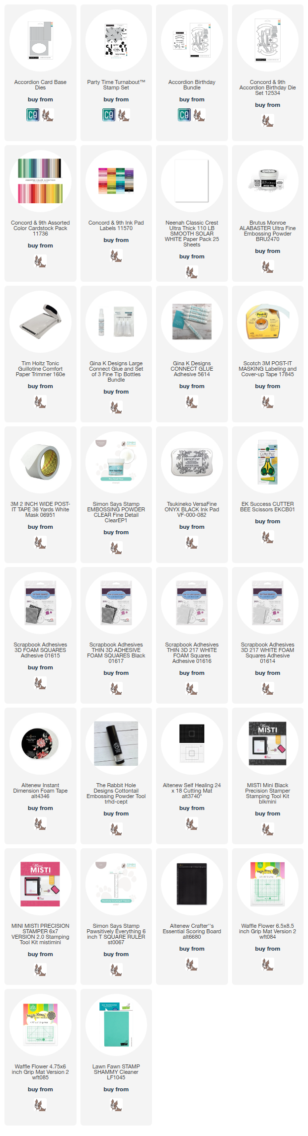
Links are below if you’re interested in any of the products I used.
*Affiliate links do not cost you any more when you shop, but it is beneficial to creators when you use them, so thanks in advance!