New Colors (& Great Products, Too)
April 2025 Release from Concord & 9th
The new Concord & 9th release is out now. I was lucky enough to spend a weekend with crafty friends and got to use some of the products before my order arrived.
As part of this April release, they also released the 6 new colors for 2025! I’m ALWAYS excited about new colors, and I’d had a sneak peek of these so I knew what was coming. (Some of these were on my dream wish list, so that makes me happy.)
This post shares a couple of cards that introduce both the colors and some of the products. I can guarantee that I’ll be sharing more soon.
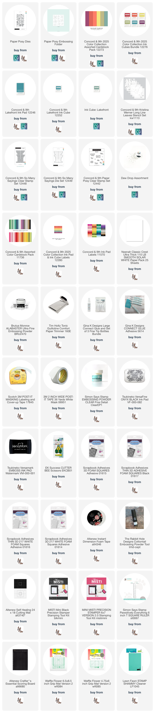
To see the whole new release, take a look at this link here.

Techniques:
The brilliant team at Concord & 9th created an embossing folder to add texture to die cuts. (Brilliant, right?) The embossing folder gives the petals and leaves a wonderfully organic crimped texture that adds so much visual interest.
I cut flowers in a range of warm colors from Brickyard to Grapefruit. I arranged them so the colors flow natrually from most red and dark to lighter.
I filled in the flowers with some assorted leaves in cool colors. The leaves ground the arc of flowers and help it connect with the background.
After arranging the flowers and leaves, I realized the background needed some texture or pattern. I was away at a retreat and didn’t have much with me, but I pulled out one of the stencils from Kristina Werner’s Long Line Leaves stencils and did some light tone-on-tone ink blending with it to create that pattern I wanted. The flowing lines and shapes work perfectly with the curves in the flower and leaves, as well as my arc of blooms.
Colors:
This card uses 5 of the 6 new colors! (See the swatches to the left of the card in the photo above.)
ink: Concord & 9th Brickyard, Pimento, Pistachio, Lakefront, Plumberry
cardstock: Concord & 9th Brickyard, Poppy, Pimento, Grapefruit, Pistachio, Rainforest, Lakefront, Plumberry


Techniques:
Layering stencils make fun cards so easy! Picking fun colors, and there are so many different combinations that totally change the look completely.
I varied the intensity of the ink as I blended to combine colors and add interest.
Colors:
This card uses the other new color that I didn’t include in card 1 - Starfruit!
ink: Concord & 9th Dragonfruit, Pimento, Creamsicle, Starfruit, Tidepool
cardstock: Concord & 9th Wildberry, Starfruit

Stay tuned for more over the next few weeks!
Thank you for visiting! I hope you get some time to create something soon.
Links are below if you’re interested in any of the products I used.
*Affiliate links do not cost you any more when you shop, but it is beneficial to creators when you use them, so thanks in advance!