Sunshine & Rainbows - Fun Folds and Many Variations
May 2025 Release from Concord & 9th
I made a birthday card for a friend using the new Sunshine & Rainbows die set from Concord & 9th. I delivered it to my friend, and was getting ready to clean up my table a couple of days later when I looked at the collection of extra rainbow pieces I had, and decided to maybe make a couple more cards and use them up. Well, that one or two became SIX more, so far. I’ll be adding them all here over the week, so check back!


Techniques:
This card looks like a gatefold, except that the two panels on the front are actually accordion folds. Rather than opening like a true gatefold, they pull out to the sides.
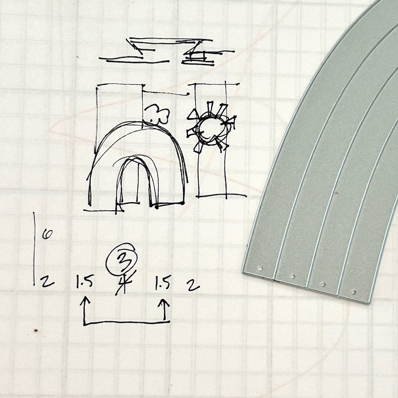
I made this for a friend who I knew would appreciate the little extra, so I wanted to come up with something that has that little extra. When I come up with a card like this, I often start with a sketch of what’s in my head, or I just jump in folding a piece of scrap paper to figure out how I want it to work. I always like to figure out the rough dimensions before I start in on the good paper. If I’m uncertain, I always leave it a little bigger than I think I might want because it is easier to trim down than add on to.
I use the sketch and scrap folds to figure out the mechanics / function of the card, and it also gives me the chance to be sure the dies or stamps I plan to use hav the right scale for the card.
If you take a look at the photo here, you’ll see that I get the rough visual of what I’m thinking, and also do a top or side view as appropriate. (The example above for this card shows the top view, above the front.
Below that sketch, you can see the dimensions as I’m planning it out. For a gatefold of any kind, if you want the inside to be fully hidden before the card is opened, the two folded sides (numbers with the arrows) need to equal the center panel (number is circled). You may notice that at first I made mine too big, thinking only about the opened size and not the fully closed, so I adapted it.
The card was quite simple to put together, actually. A stenciled monochromatic background, and some die cut elements.

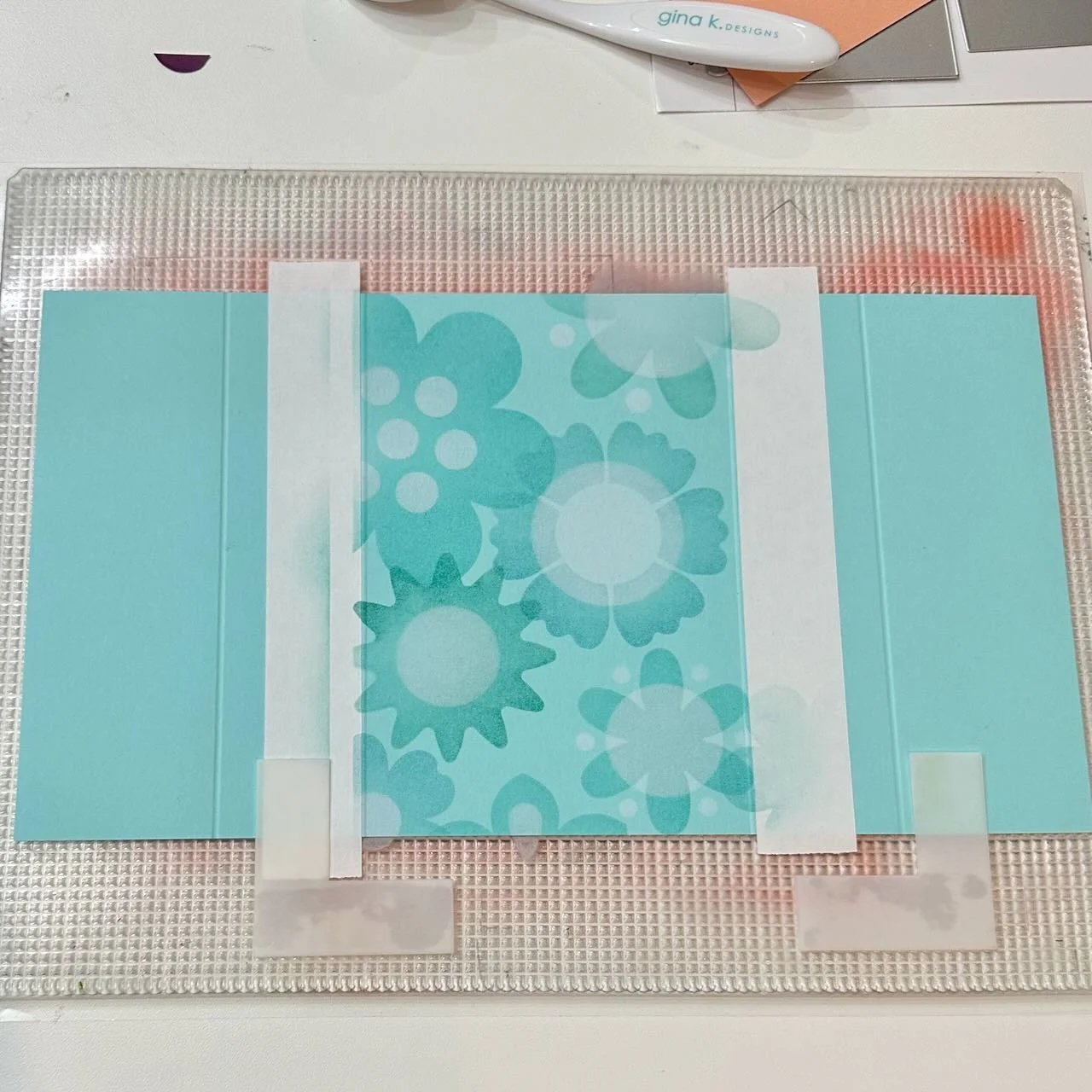

I added the bright die cut rainbow and sun elements with 1/16” foam tapes to add a little dimension. The rainbow is only attached on the left side, so it lays over the right flap when folded, but opens up with the card.
I used a folded paper support for the cloud, because I wanted it to lay flat when folded. The new Simple Pop-Up Dies set is perfect for those, and includes lots of variety of size/thickness options, or DIY one if you’re comfortable with that. (Which is how I’ve always done it, until now.)
Colors:
ink: Concord & 9th Aqua Sky, Powder, Blueberry, White.
cardstock: Concord & 9th Dragonfruit, Sweet Pea, Pimento, Sorbet, Sunflower, Buttercup, Aqua Sky.


Approach:
I love the look of that fun rainbow, and I had leftover die cuts from that first part, so I arranged another rainbow and realized that having a card the shape of the rainbow itself would be fun.
Techniques:
Since that first rainbow is crated with only warm colors, I created a second rainbow to layer behind out of cool colors, for two color- based reasons:
color theory: cool colors recede, warm colors are generally more “forward” appearing
contrast: If the colors were too similar, the differentiation of the shapes wouldn’t stand out as much
Because I used a background structure on the previous card, I didn’t want to rely on that this time. I created clear z-folding connecting hinges out of acetate to connect the two rainbows at the bottom of each arc. This creates a nice rectangular (ok, less square and more of a simple parallelogram) base so it can stand, yet also be flattened to fit into an envelope.
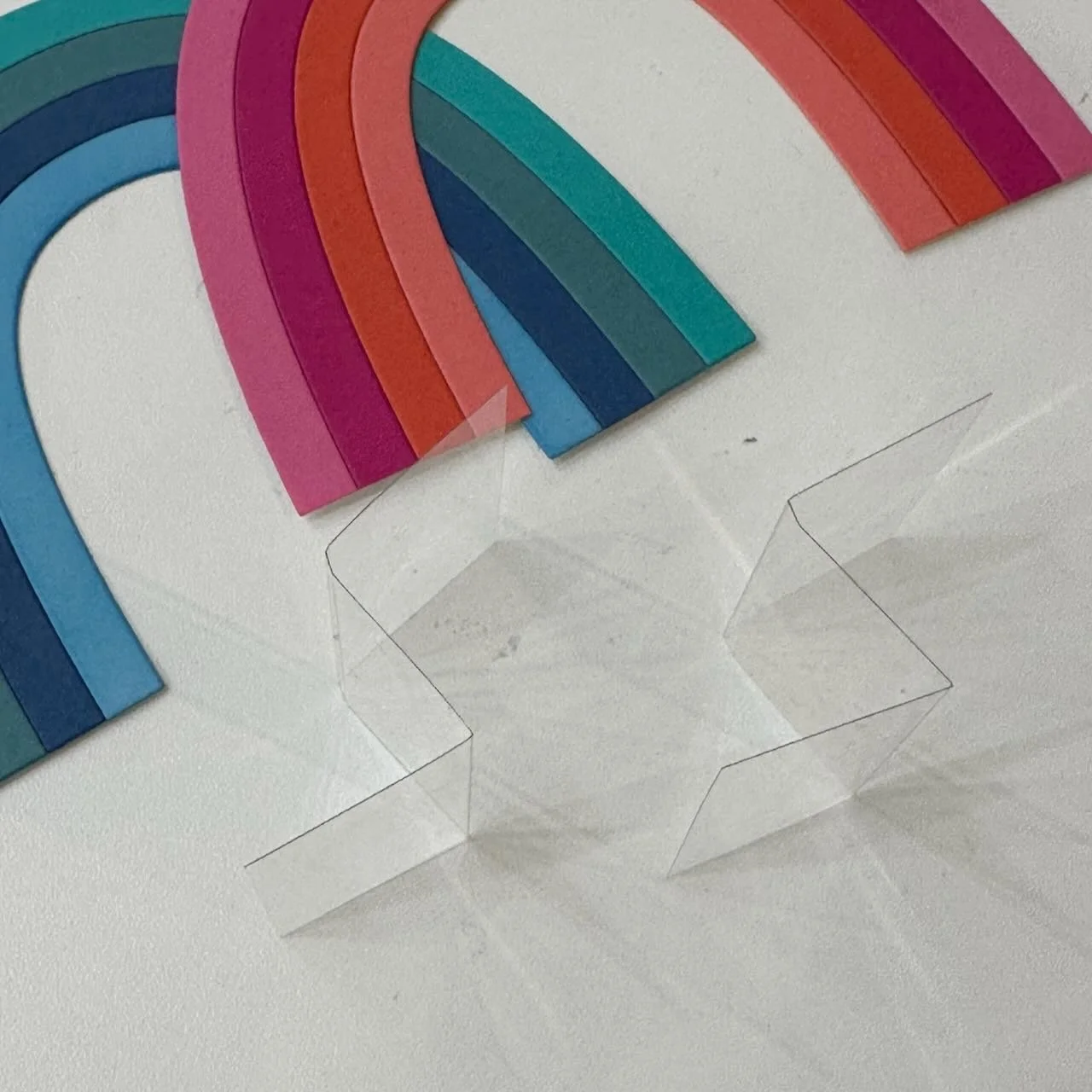
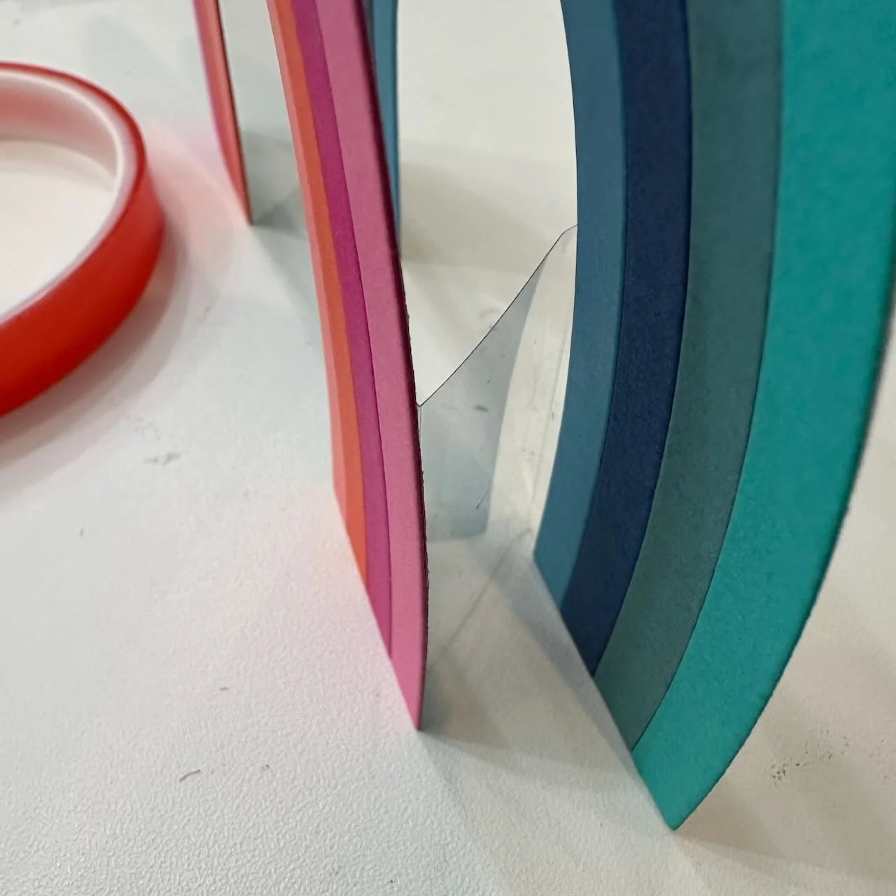
I made sure to line up the rainbows and hinges so that when flattened, just a single band of the back rainbow shows to the side of the warm one, just as if I’d drawn a shadow or 3D effect.
When not held closed, you see more of the cool colored rainbow around the sides of the front/warm one.
The cloud on the right side of the back rainbow is made of two pieces. I wanted it in front of that rainbow end, but also wanted it to visually continue beyond the acetate hinge, so there’s a second piece off the back of that section that extends to the left.


The clouds are sprayed with a shimmer spray, for a little sparkle.
Colors:
cardstock: Concord & 9th Sweet Pea, Dragonfruit, Pimento, Watermelon, Buttercup, Oceanside, Lakefront, Blueberry, Harbor


Techniques:
On the back of the original card, there’s a white panel and a small rainbow - in colors matching the big one on the front. In the process of cutting the cardstock colors for that small rainbow, I ended up with extra parts, and wanted to put them to use.
Using a bright sunshine yellow seemed an obvious choice to use with that greeting die, but it was also a nice variety to the two previous cards (which had very little yellow), so I jumped in and did it.
Creating the sun die cuts from the same cardstock as the background allows the depth and dimension to create the interest, but allows it to take a supporting role to the bright rainbow and crisp white greeting. (The three elements together create a nice strong focal point on the card front.)
Stamping the background with the Kristina Werner Design Bold Circles stamp, with Versamark embossing ink, creates a great pattern that also repeats the circle in the sun die.
Colors:
ink: Versamark Embossing Ink
cardstock: Concord & 9th Dragonfruit, Sweet Pea, Watermelon, Pimento, Buttercup


Techniques:
Card 3 used a full small rainbow, but even the single pieces are cute, so what if I made rainbows with only 2 of the lines? These little rainbows using only every other die cut give me the feel of a cute hand-drawn rainbow doodle.
I paired those little doodle rainbows in the bright warm colors with a couple of deeper monochromatic backgrounds. Both of these cards have some pattern on the background by using:
Card 4: A deep and lighter teal color, with a touch of debased texture from one of Kristina’s Finishing Touches dies.
Card 5: A cover die used to emboss, and the addition of a pair of cute dimensional clouds in the same color (with shimmer spray added).
Colors:
ink: Concord & 9th Lakefront (on Card 4).
cardstock:
Card 4: Concord & 9th Sweet Pea, Pimento, Peacock, Lakefront.
Card 5: Concord & 9th Dragonfruit, Watermelon, Plumberry.

Stay tuned for more over the next week or so.
Thank you for visiting! Let me know if you have any other process questions.
I hope you get some time to create something soon.
Links are below if you’re interested in any of the products I used.
*Affiliate links do not cost you any more when you shop, but it is beneficial to creators when you use them, so thanks in advance!