Personalized Cards with Letter Dies
from Honey Bee Stamps
The Honey Bee Stamps Makers Mix release is FULL of so many creative pieces to use in any season. I got inspired by a couple of the die sets to create these two cards.
Each card was personalized with color and theme for each recipient. Both happen to be for Gen Z girls, and were targeted for back to school time, but I think these could also be used for so many other recipients and occasions. (Stay tuned! I have more variations coming!)


Techniques:
This design included a few personalized features:
One of the school colors for this college senior
Her favorite color
She likes flowers, and patterns, so I included that
Her year in school, as well as her areas of study.
The background was created by embossing a card panel with a cover die - twice (one in each shade of pink). It creates such an interesting quilted-like dimension. I cut the brighter one and layered it over the light pink for a color-block effect.
I cut the zipper pouch dies from two colors of cardstock - one just a shade darker than the other. You can also accomplish this with ink blending or any other form of coloring to create the colors you want. I stamped a floral stamp on the front piece of the pouch before I glued the layers together, and then added the whole thing to the card front with foam tape so it stands out.
I cut the school letters on the front out of white, and the same darker orange used as the secondary color on the pouch. Offsetting the colors creates a stylized shadow effect.
On the two die cut hearts I ink blended the edges for additional interest.
Colors:
cardstock: Concord & 9th Sweet Pea, Pink Lemonade, Clementine, Spiced Cider. White.
ink: Concord & 9th Sweet Pea and Clementine.


Techniques:
You can see the general approach for the zipper pouch is similar to the one above, so I’ll point out some differences.
The background is ink blended with layering stencils.
The front zipper pouch panel is stamped, but this time I also embossed it with gold embossing powder.
I wanted to be able to tuck in a note, so when I attached the front piece of the pouch I only attached it on the sides and bottom, so there is room for a little note. (If you use very thin foam tape instead of flat adhesive, the note will slide in and out more easily, but both approaches work.)
I kept the overall design mostly monochromatic so her name and the peek of the note would stand out.
Colors:
cardstock: Concord & 9th Aqua Sky, Lilac, Grape Soda, Gold Metallic.
ink: Concord & 9th Aqua Sky, Lilac, Grape Soda.


Thank you for visiting! I hope you get some time to create something soon.
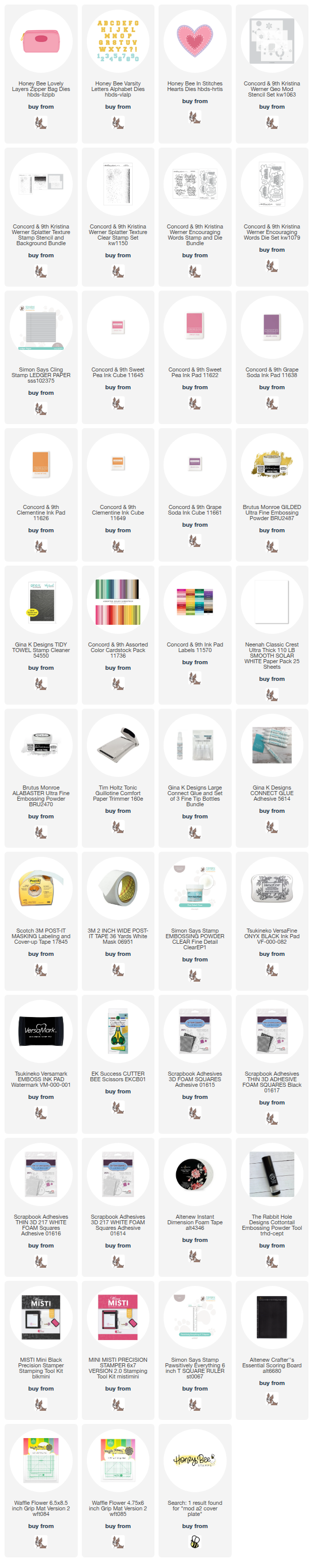
Links are below if you’re interested in any of the products I used.
*Affiliate links do not cost you any more when you shop, but it is beneficial to creators when you use them, so thanks in advance!