Two Variations with A Stencil & Stamp Set
July 2025 Kristina Werner Design
I created two cards using the same products, and the same core colors:
Pimento, Clementine, Creamsicle, and Blueberry
I also used the Daisy Bouquet Stencils and Splatter Texture stamps from Kristina Werner Design on both cards.
Techniques:
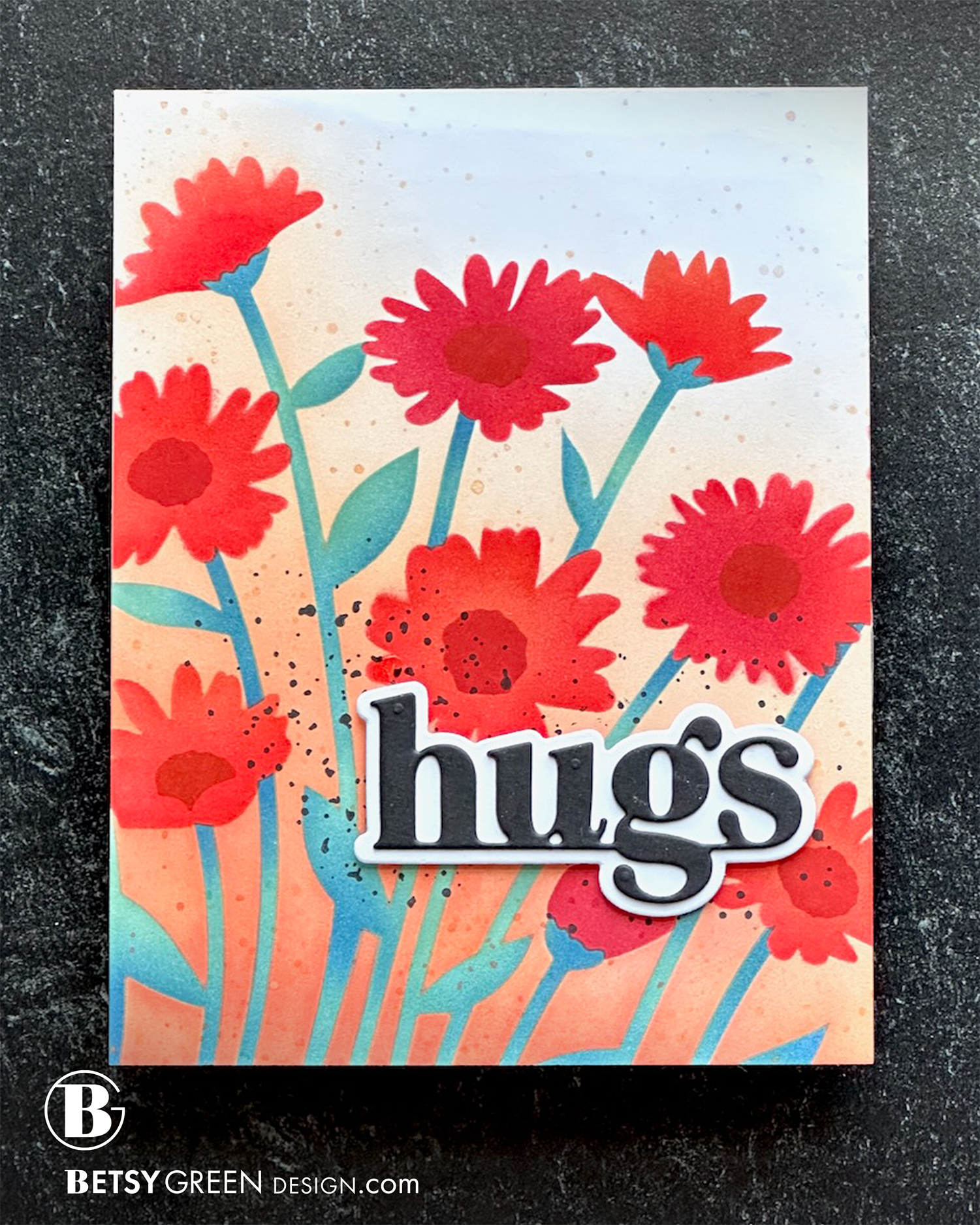
Placing the stencil offset at an angle created more white space in the upper right corner.
I used all the layers of the stencil for this one, with a blend of colors on each layer.
Once I finished the ink blending, I used the Splatter Texture stamps in a few different colors at different areas of the card panel.
The repetition is a design technique that adds to the flow and connection within the layout.
Using black for splatter where I planned to put the sentiment helps anchor it and grounds it in the place on the background.
The black and white crisp bold color of the greeting stands out against the ink blended background of the panel.
Colors:
cardstock: Concord & 9th Black and White.
ink: Concord & 9th Pimento, Cayenne, Clementine, Creamsicle, Eucalyptus, Blueberry.


Techniques:
This time, the stencil placement was centered and aligned with the card panel.
I ink blended only the background and some of the flower centers. I used one of the Splatter Texture stamps over the stem layer and on the centers as well.
Trimming the panel to be less wide allowed the panel to be the right proportions to fit nicely in a 5” x 7” card base created with Blueberry cardstock to pull in the the blue used for the splatters and ink blending of the centers.
I added some splatter on that Blueberry base to add flow, visual interest, and to connect the background with the artwork.
The greeting is cut out of Pimento, and layered on a stack of white die cuts. This repetition helps visually tie the card elements together. Having the right edge break across the edge of the flower panel also adds to the flow and visual interaction between the ink blended panel and the background. It creates a dynamic layout.
Colors:
cardstock: Concord & 9th Pimento, Blueberry, White.
ink: Concord & 9th Pimento, Clementine, Creamsicle, Blueberry.

Thank you for visiting! I hope you get some time to create something soon.
Links are below if you’re interested in any of the products I used.
*Affiliate links do not cost you any more when you shop, but it is beneficial to creators when you use them, so thanks in advance!