Simple Card + Design Principles Explained
Hello! Things don’t need to be complex or complicated to be well-designed.
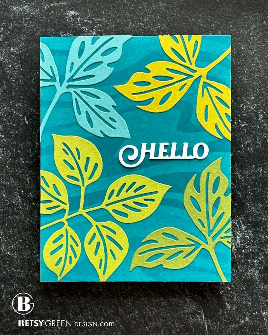
This card is one that’s pretty quick and simple to make, but I wanted to point out a few design principles that it illustrates.
The dies and stencil used on this card are listed below, but you can take a look at the complete new release from Simon Says Stamp HERE!
Approach:
When I get products for a new release, one challenge I like to give myself is to use multiple products on one card. This card uses four of the new items. (Even better, they’re all some of the items from the release with a lower price point too, if that matters to you.)
Techniques:
This card is created with die cuts as the main subject and interest, but with a layering stencil used to provide some subtle background pattern.
I did not use all of the layers from the stencil, but just a couple of them and selectively filled in some of the waves so I’d have just enough pattern.
I wasn’t thinking of them intentionally as I created this card, but it is a good example of a number of design principles. I’ll outline just a few of them here.
Repetition: You can see repetition shown by the use of the die cut leaves and the pattern the stencil created on the background. Repetition doesn’t have to mean identical, but it does create a sense of pattern and a visual rhythm. (Our brains like pattern, and seek it out even if we are unaware of it.)
Contrast: There is some contrast in color of leaves here, but the best illustration of it on this card is the Hello greeting. That die cut greeting is a stack a few layers thick, so it stands out dimensionally from the rest of the card. In addition, the bright white greeting stands out with color/value against the deep teal card base and the green and blue leaves. Things don’t have to be big to have an impact, and this greeting shows that. Small but mighty.
Additionally, the pattern in the background is has a very subtle contrast to the teal cardstock it is on, and that allows it to remain in the background and not compete with the die cut elements for interest. In that case, it works (and doesn’t make the card look “busy” or cluttered) because of the lack of contrast.Emphasis: Sometimes also referred to as focal point, which helps describe it. It is where our eyes land when we look at something. It is sometimes paired with contrast, as on this card, but not always. (It can also be created with flow, or white space, among others.) Here it is that contrast of the white die cut greeting that really has the emphasis, supported by the trio of green leaves all pointing toward that greeting. Take a look - it isn’t obvious until you really see it.
Scale or Proportion: Notice that the leaves are all considerably larger than the greeting, and than the background pattern. Good design often (but not always) incorporates variation of scale. This is especially important when mixing patterns, but in this case, the variation in scale allows the greeting and leaves to work together well.
Variety: Including the leaves in different colors, placing them at different angles, and even using two different leaf dies all illustrate the use of variety. Variety doesn’t need to be a lot going on, but it keeps the design interesting and pulls us in to look longer.
Colors:
cardstock: Concord & 9th Lemongrass, Avocado, Artichoke, Lakefront, Peacock. White.
Thank you for visiting!
Do you like learning how design principles are at work in my card design? Let me know, so I know whether to do more posts like this, or not bother. (I’m still debating whether I should bother posting here or just on my instagram feed, so I’m open to whatever feedback you have.
Links are below if you’re interested in any of the products I used.

*Affiliate links do not cost you any more when you shop, but it is beneficial to creators when you use them, so thanks in advance!
