
Ways to Use Background Stencils
August Release from Kristina Werner
The August release from Kristina Werner includes a couple of great background stencils that can work for subtle effects or bolder designs.
Techniques:
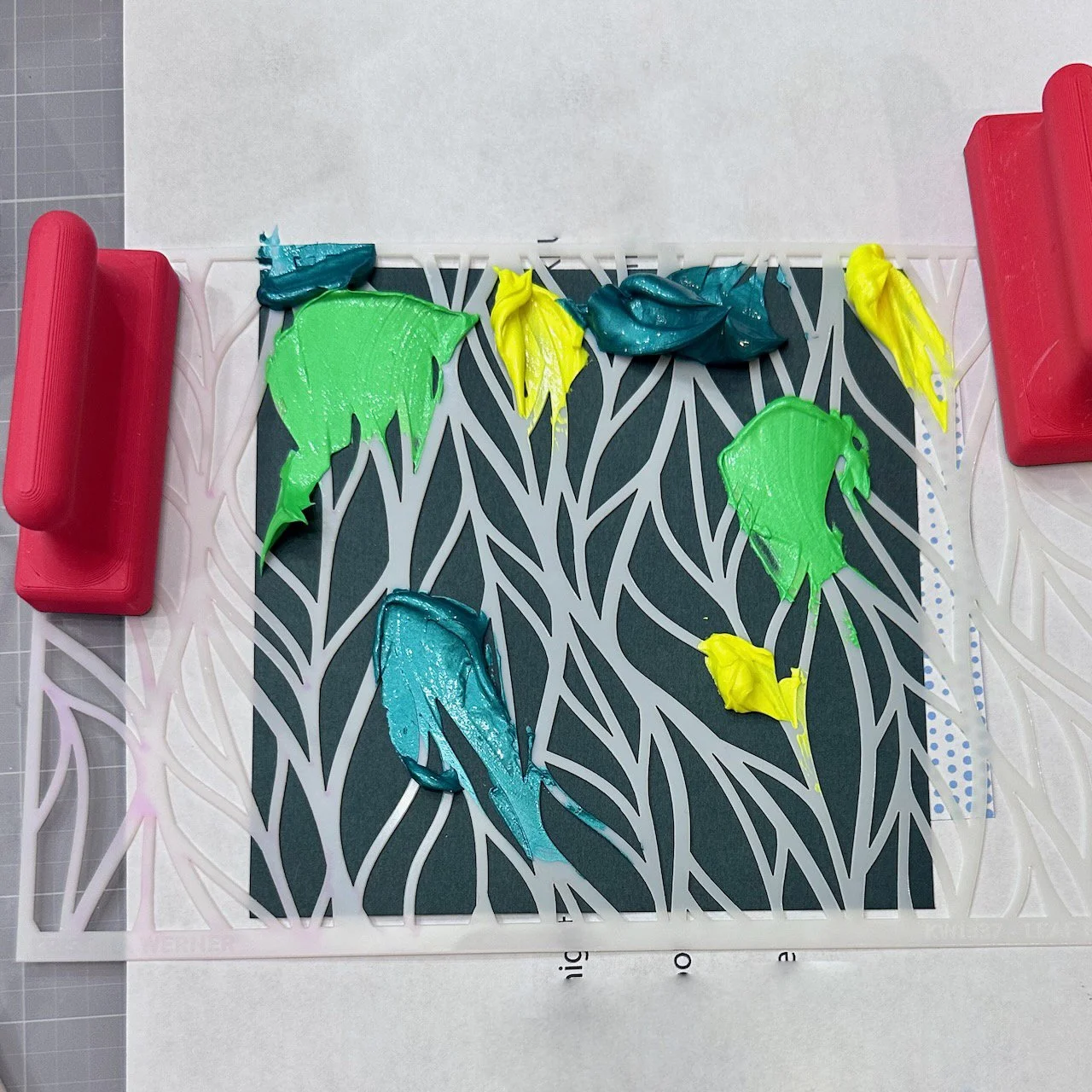
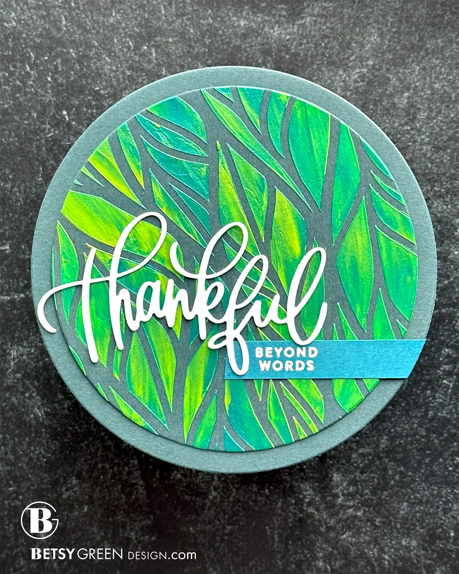
I used a 5.5” square piece of Rainforest cardstock as my base.
To create some color on the dark background I used 3 colors of Lunar Paste through the stencil. I love the texture and shimmer that it adds - especially on darker colors.
I wanted a varied mix of colors through the stencil so I chose some that would blend well. (Choose colors nearby on the color wheel.) Applying them randomly spread over the stencil helped me create that variation so it wasn’t consistent stripes. Mixing in the neon yellow adds good highlights through the leaves.
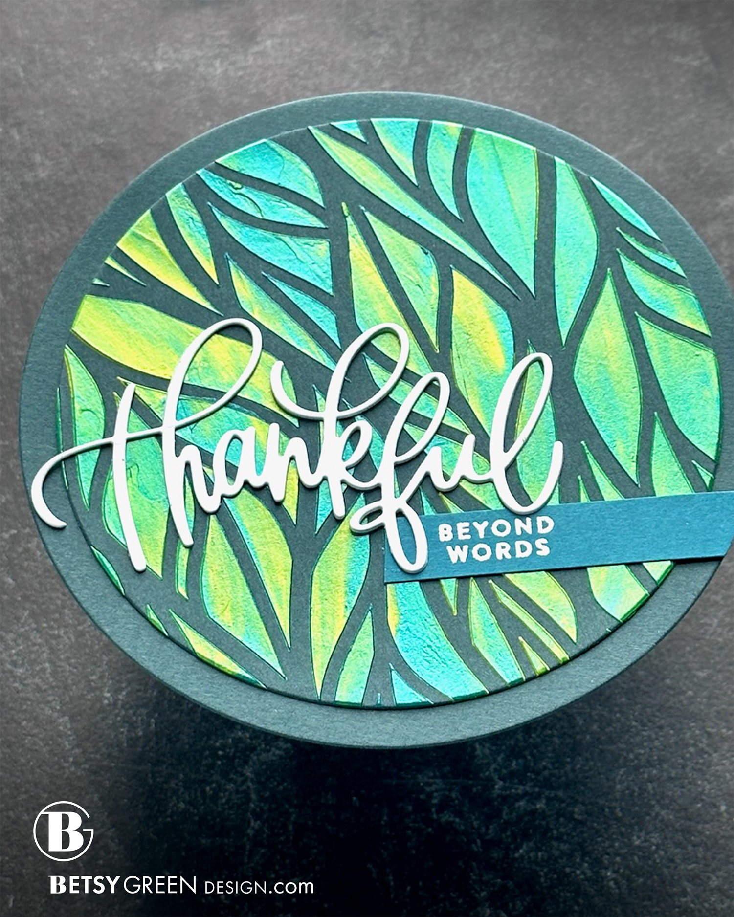
Once it was fully dry, I cut the stenciled panel out with a circle die, and then used a larger size to cut a base in the same Rainforest color that serves as a mat. I liked the dynamic look it has at a slight angle, so I rotated it before attaching it to the base.
The new script greeting is stacked 3x, for another layer of dimension on top of the stenciled pattern.
I white heat embossed the secondary sentiment in a color that coordinates with one of the stencil colors, and trimmed it to tuck in right under the script. (I trimmed the left edge to line up with the pattern.)
Colors:
cardstock: Concord & 9th Rainforest and Peacock.
Lunar Pastes from Simon Hurley: Voltage (Neon), Dart Frog (Neon) and Tropical Tango.
Techniques:
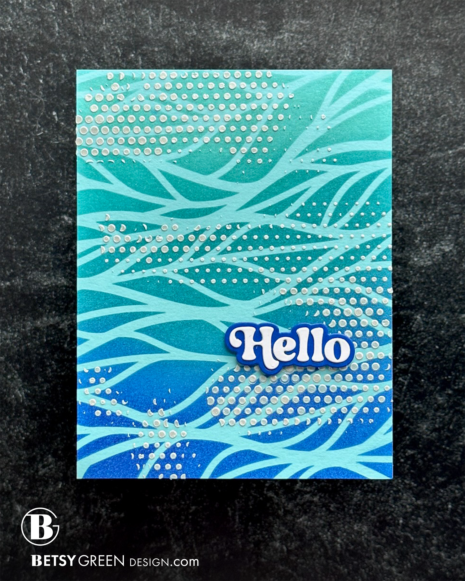
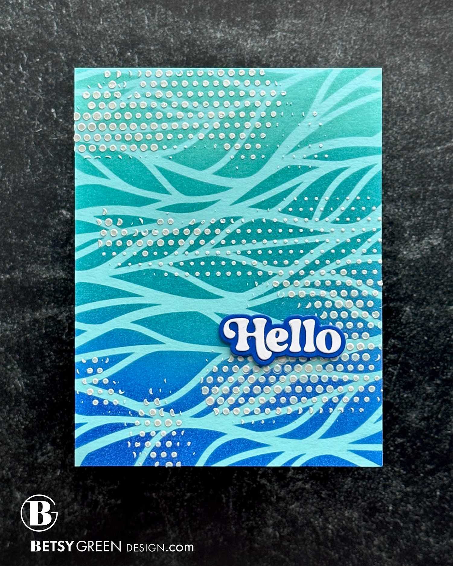
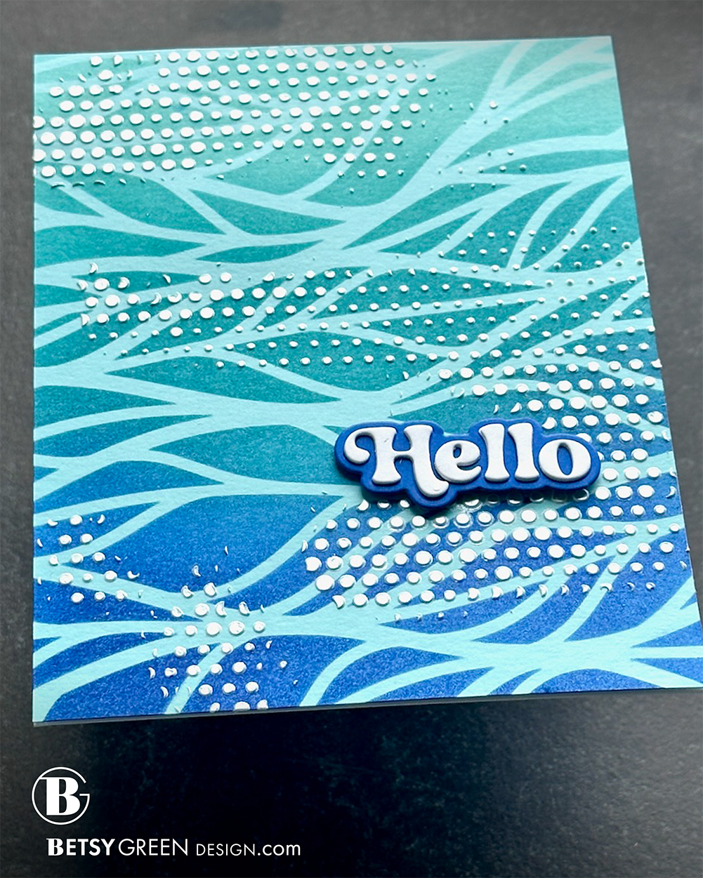
Consider using your stencil at a different angle. These large stencils are designed to fit two side-by-side A2 cards, or a 5×7. While my initial instinct was to use it so the leaves are vertical, rotating it sideways gave it an almost wave-like look.
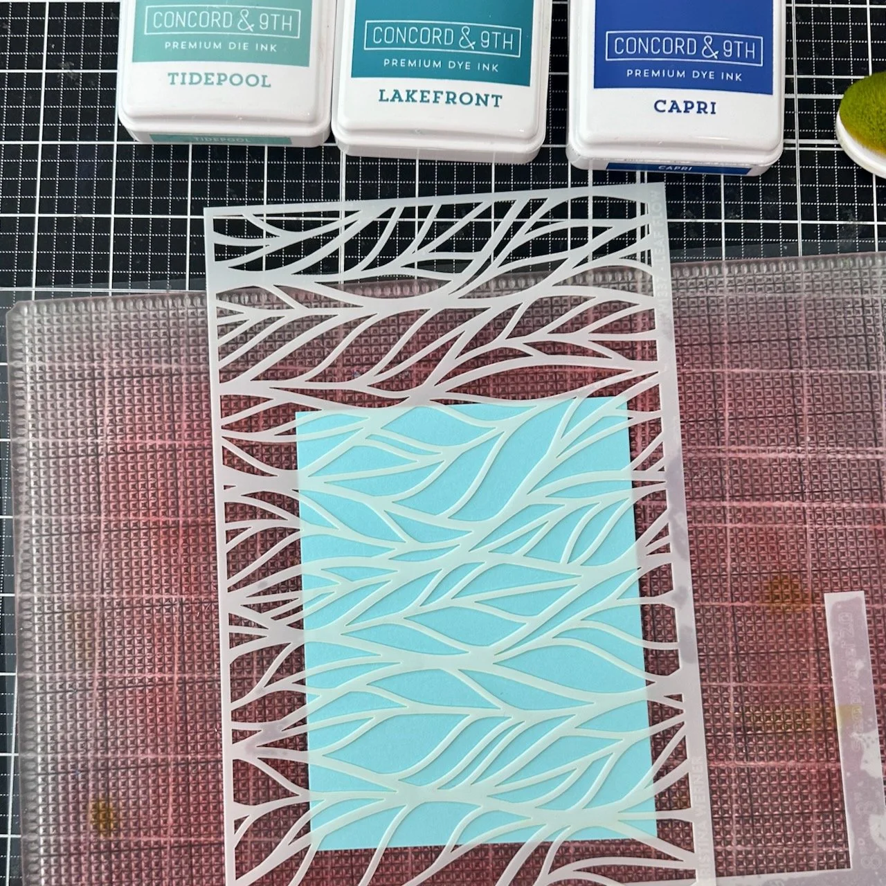
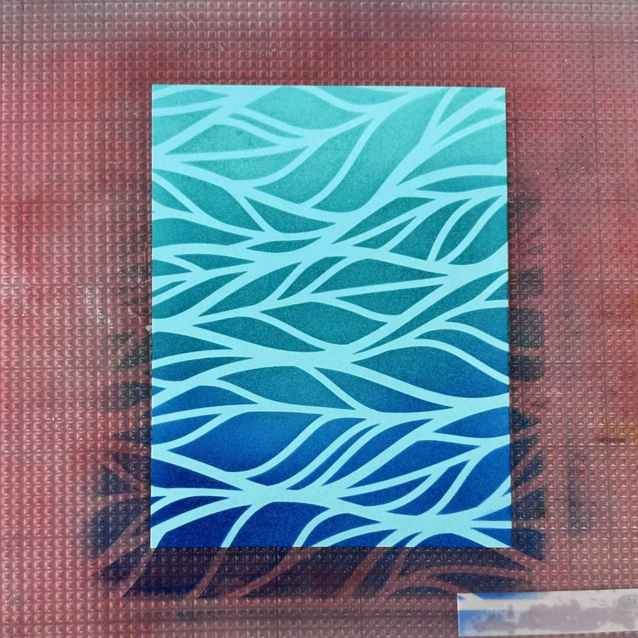
I used the outline stencil only for this card, but ink blended a few colors through it to create a blend and an increasing level contrast from the top to bottom of the panel.
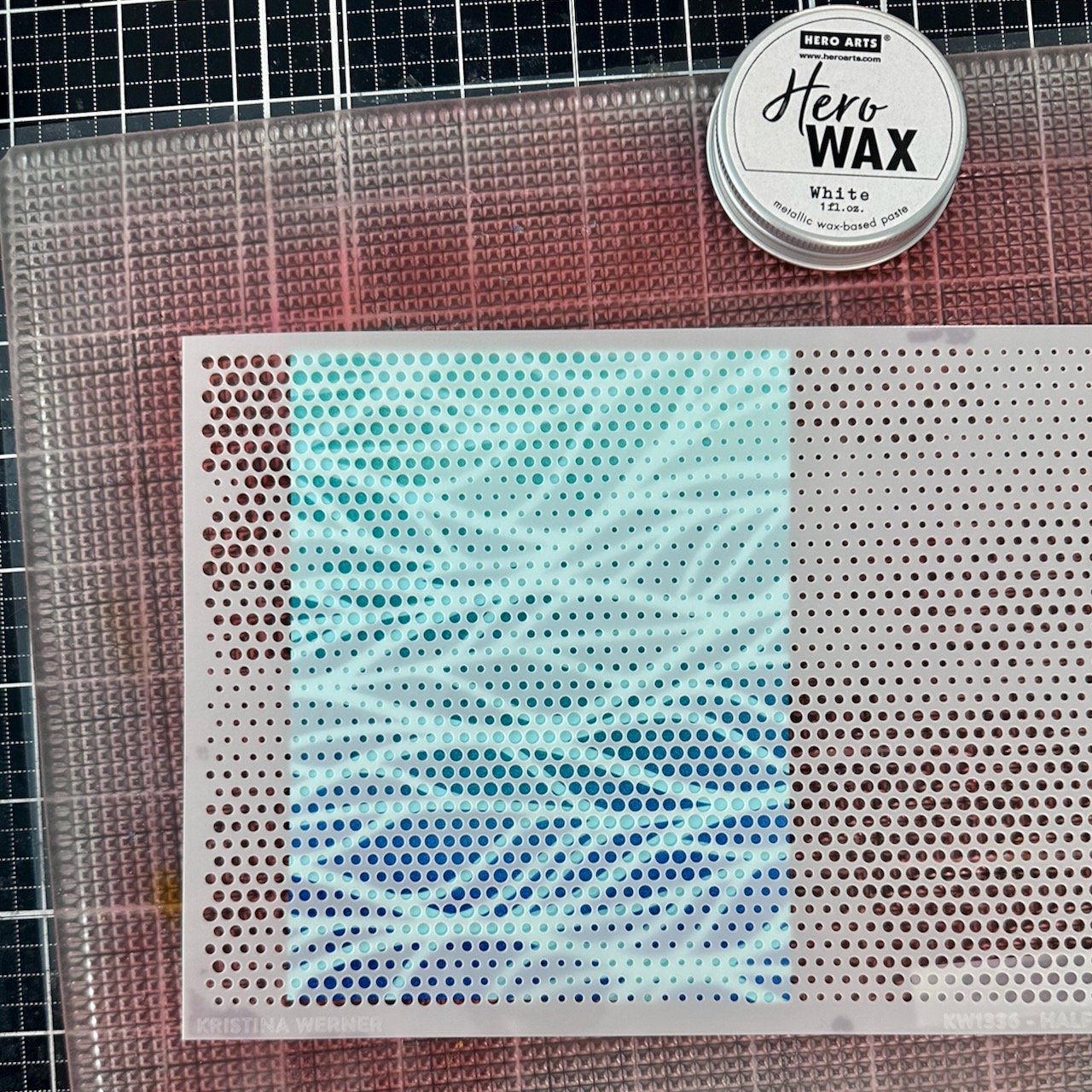
To add another layer of pattern, some texture, and some brightness I added a layer of white paste through a different patterned stencil on top of that ink blending. These two stencil patterns work together because the scale of each pattern is different. The halftone dot is much smaller, and though the circles in it vary in size, they are very organized in lines which also helps balance out the more loose-looking and organic wavy stencil.
I used Hero Wax in white, but most other white pastes would work here also. Another feature that this offered me is to add a bit of shine to my otherwise matte finish card. Another detail of contrast that adds interest.
I didn’t add paste through the whole stencil, but instead applied it just in areas. I didn’t plan that out in advance, but I alternated where those were from left to right and top to bottom of the panel so they were not perfectly size or perfectly lined up. I applied them in horizontal “swashes” to maintain consistency with the flow from the leaf stencil. My goals were for a balance composition, and adding a detail of movement, while not covering all of the first stenciled layer.
Colors:
cardstock: Concord & 9th Aqua Sky and Capri.
ink: Concord & 9th Tidepool, Lakefront, Capri.
Techniques:
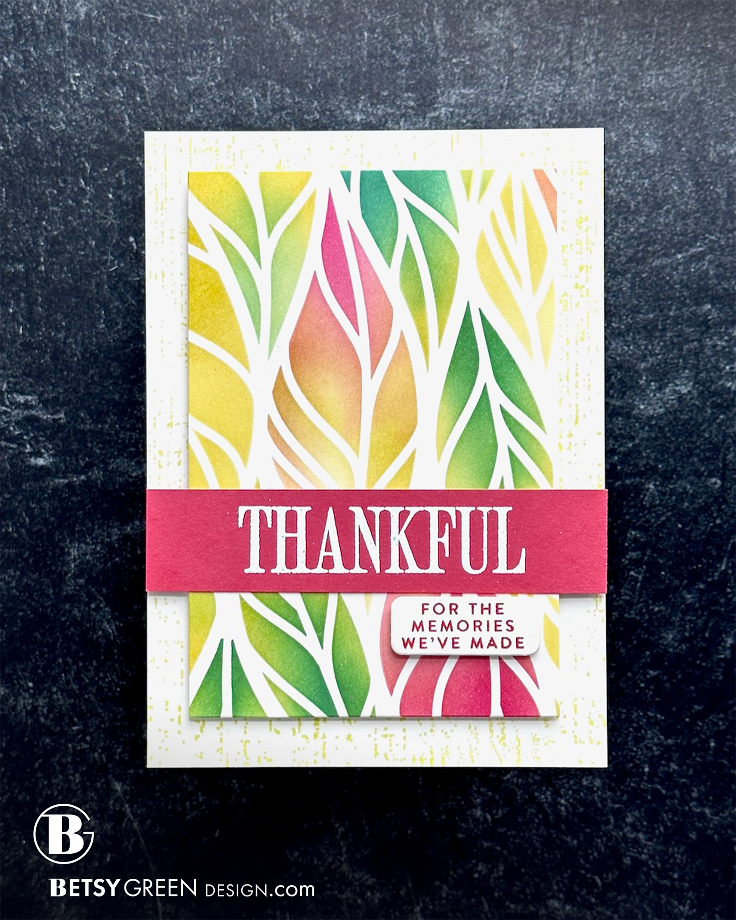
coming soon
Colors:
inks: Concord & 9th
Thank you for visiting! I hope you get some time to create something soon.
Links are below if you’re interested in any of the products I used.
(Listed by company, with links to Concord & 9th and Simon Says Stamp. *Affiliate links.)
*Affiliate links do not cost you any more when you shop, but it is beneficial to creators when you use them, so thanks in advance!