Stencils & Color
These cards highlight the Holiday Icons Layering Stencils from Kristina Werner. (Along with some other products from her September 2025 release.)

Techniques:
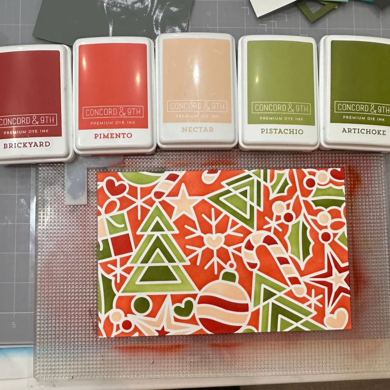
These first two cards started out with a 5 color Concord & 9th ink color palette. I used Pimento for the background color because I wanted that bright warmth, and paired up the others. I used the full stencil area, so I had backgrounds for two cards as a result. I cut the large panel in half so I had two A2 sections once I was done with the ink blending part of stenciling.
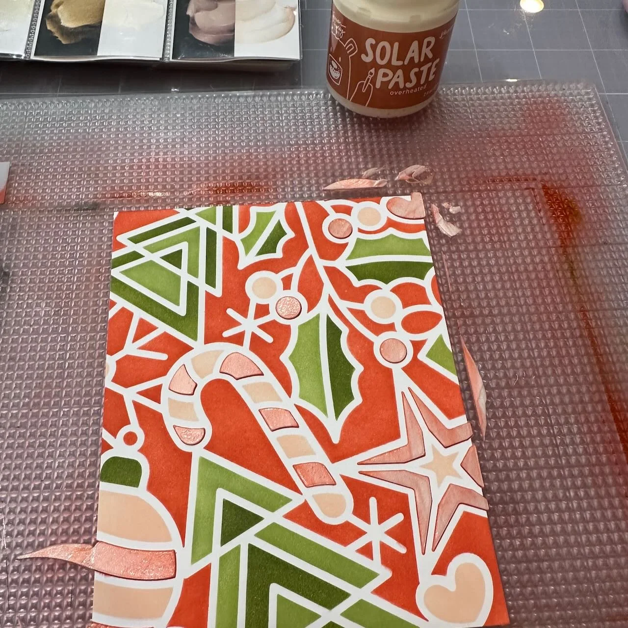
I chose one of the panels, and lined up one of the stencils on it so I could add paste through that single stencil. I used Overheated Solar Paste on top of the areas of this single panel that I’d inked with Brickyard. (I really love the pastes from Simon Hurley!)
I worked on the other card while that was drying, but once it had dried fully I used the scalloped edges die from Kristina’s Essentials dies to cut the panel.
After adding wide 1/16” foam tape behind the panel, I placed it on an A2 Cranberry card base. (I stepped up the background color to Cranberry instead of Brickyard for additional contrast.)
The greeting is simple - stamped and embossed in white on the darker of the two greens used on the card. I added that with foam for dimension also. The simplicity of that balances nicely with the bold pattern and color of the stenciled Holiday Icons pattern.
Colors:
cardstock: Concord & 9th Cranberry and Artichoke.
ink: Concord & 9th Brickyard, Pimento, Nectar, Pistachio, Artichoke.


Techniques:
This card uses the other half of the stenciled panel from the first card. I cut the stenciled pattern with a large circle die, making sure to center the die over the large tree so it would be the focal point of the card.
I added a few layers of circle die cut behind that, to give it dimension, and used a white ring from the Circle Frame dies around it - to repeat the width of the white line through the stenciled pattern.
This time, I placed it all on a lighter colored background - mainly Nectar, with a band of Grapefruit for grounding. Before attaching the circle layers, I used the outline stencil and some Grapefruit ink to ink blend just a bit of that pattern on the Grapefruit band. (If you look closely, you will see that I also lined up the stencil carefully to be sure that Holiday Icons background pattern is continuous from bold circle to soft background.
A simple die cut and stacked word is accented with a few white enamel dots of help direct the visual flow through the card.
Colors:
cardstock: Concord & 9th Grapefruit, Nectar, Mushroom, White.
ink: Concord & 9th Brickyard, Pimento, Grapefruit, Nectar, Pistachio, Artichoke.
Thank you for visiting! I hope you get some time to create something soon.
Links are below if you’re interested in any of the products I used.
*Affiliate links do not cost you any more when you shop, but it is beneficial to creators when you use them, so thanks in advance!