2025 Holiday Card
This is the newest edition of my annual holiday card series that has been every year for about 31 years. (I’m not sure which year I started. I have at least one card saved from almost every year of that time period.)
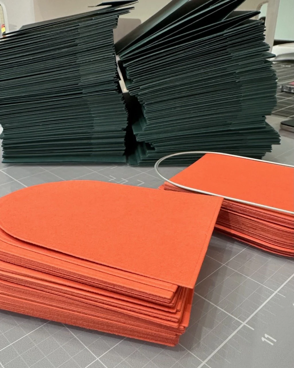
I design and create the card for our family & friends card list. This year, we mailed a few over 130. This means that while I want the card to be interesting and unique, it has to be done in mass quantity and in a short time frame. As much as it is hard to find time to fit it in each December, I do enjoy the process - from concept to completion. I usually say I’m going to start sooner, but that rarely happens.
My rough timeline this year:
Figured out my official color palette in late November.
Finalized the design late in the second week of December.
Started prepping the pieces December 13. (Right before going out of town for a few days.)
Back into production mode on December 18.
Mailed the first 125 or so on December 20. (Thankfully my local PO is open until 2pm on Saturdays.) The remainder were mailed over the next week as we got addresses for them.
Challenges: (all self-imposed)
More than a flat photo or standard single fold card.
Use a different primary/base color than the previous year. I tend to not do the traditional red and green color palette, but there is always some variation of red or green on the card.
Use different imagery, pattern, and/or texture than the previous year.
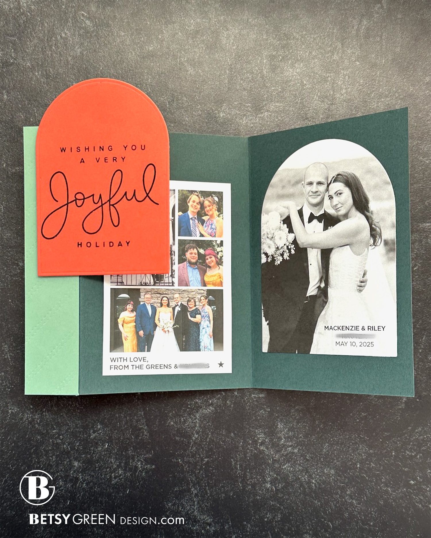
Include some family detail or info, but never a standard letter. (This year I simplified a bit due to timing and did that just with photos and the wedding date of our oldest daughter.)
Be mailable with a first-class postage stamp.
Always include a star somewhere.
Techniques:
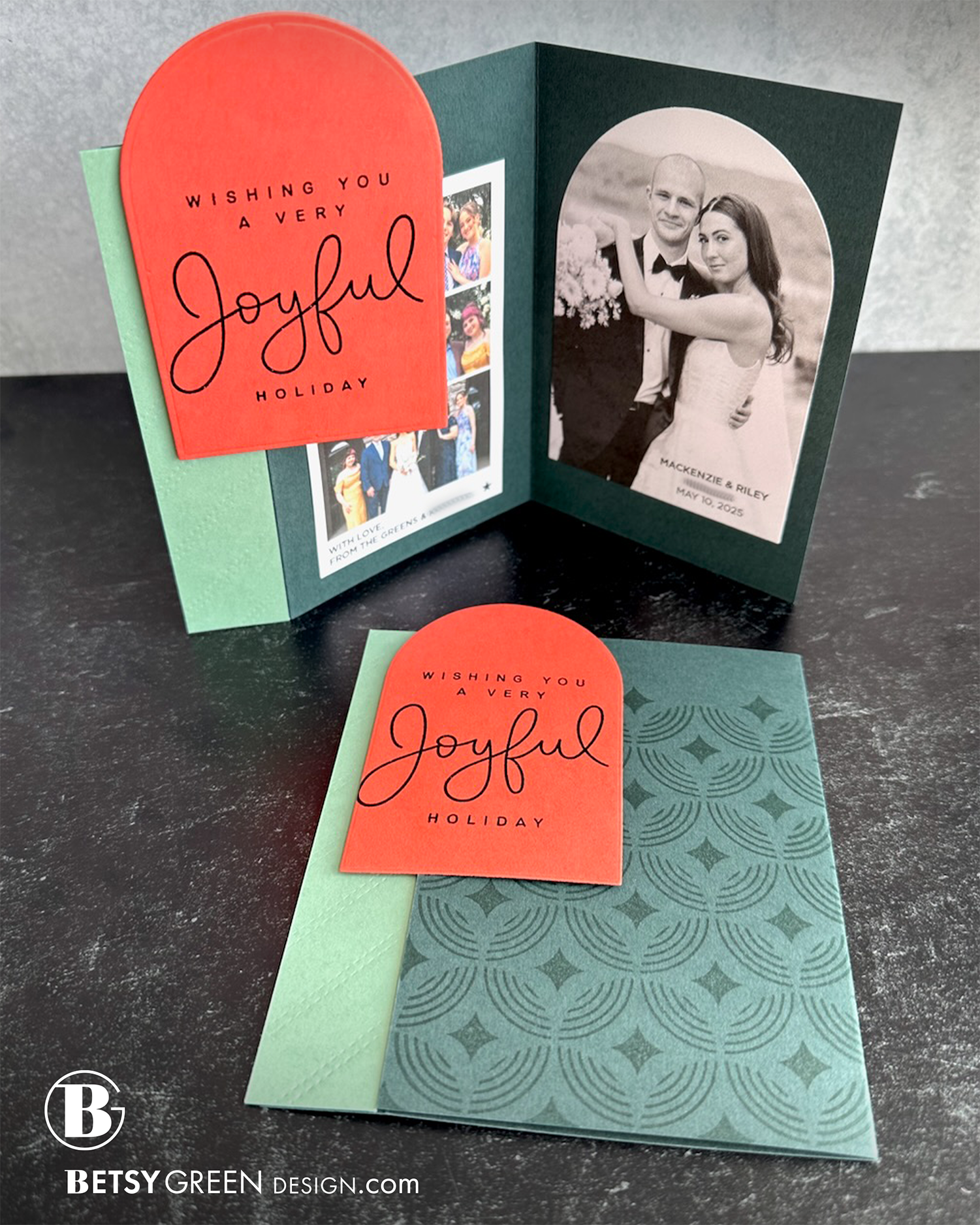
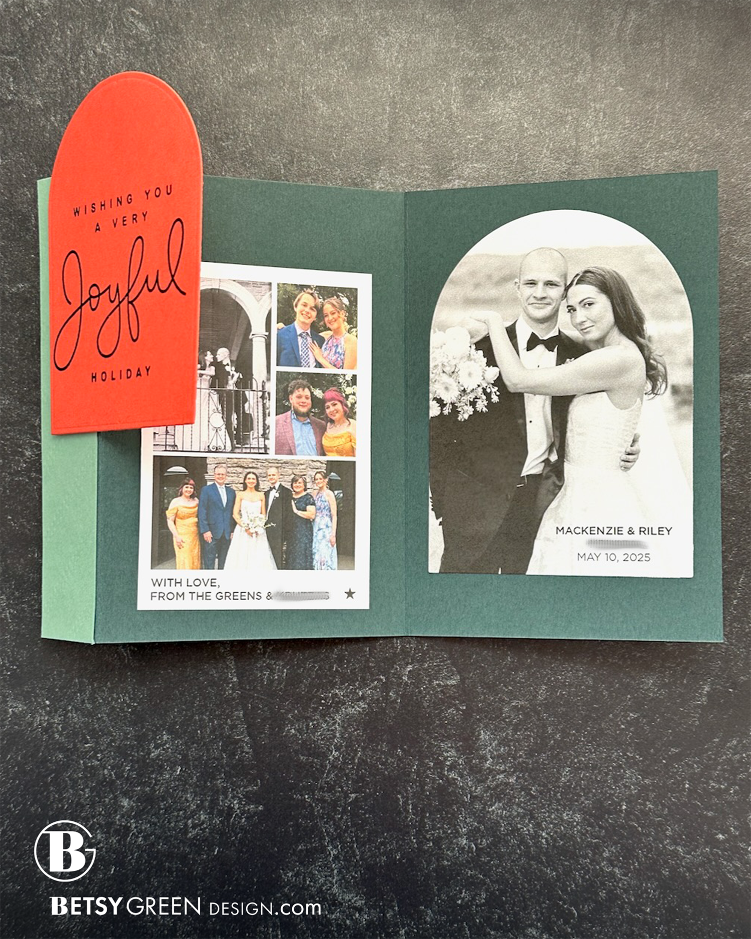
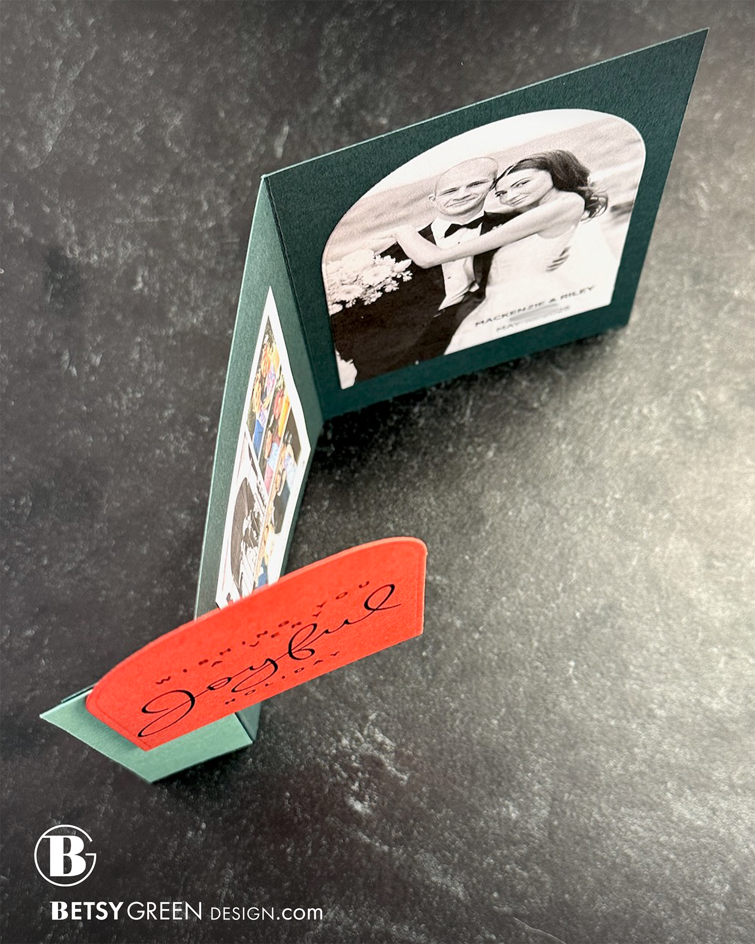
I used a hinge fold on the card this year, inspired by my friend. You can see more about it in this video from her.
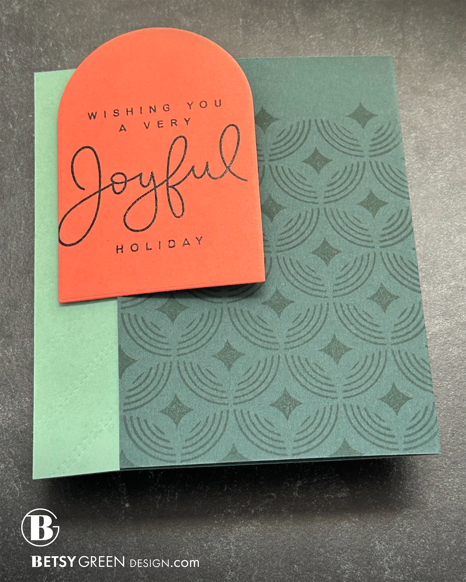
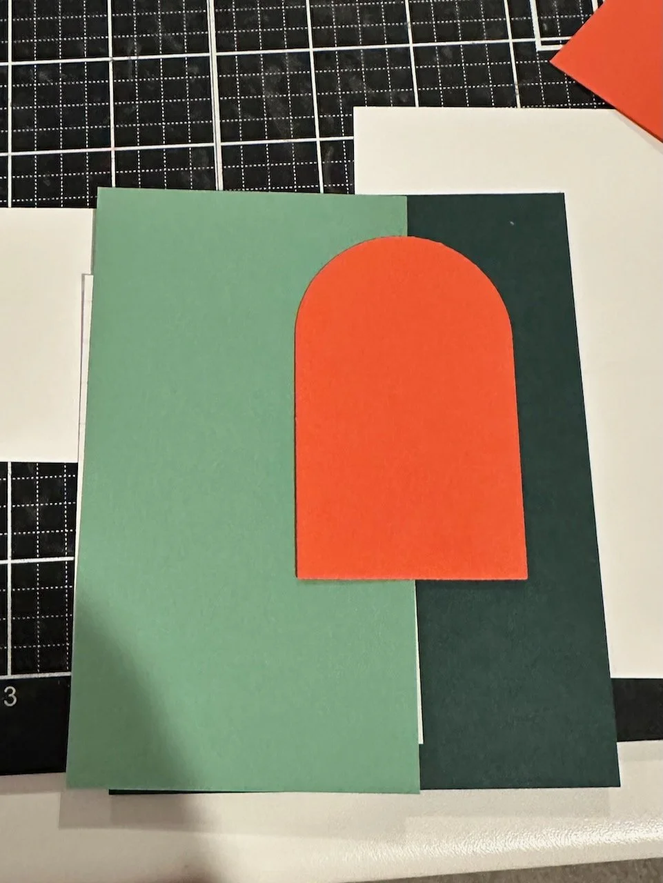
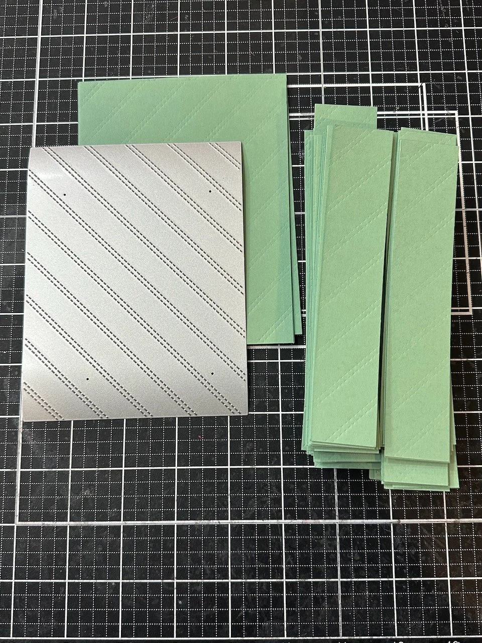
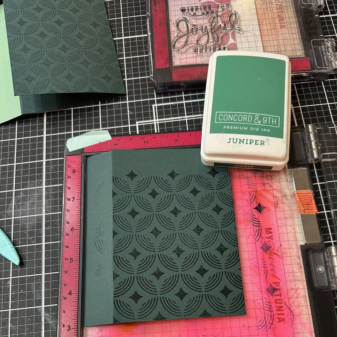
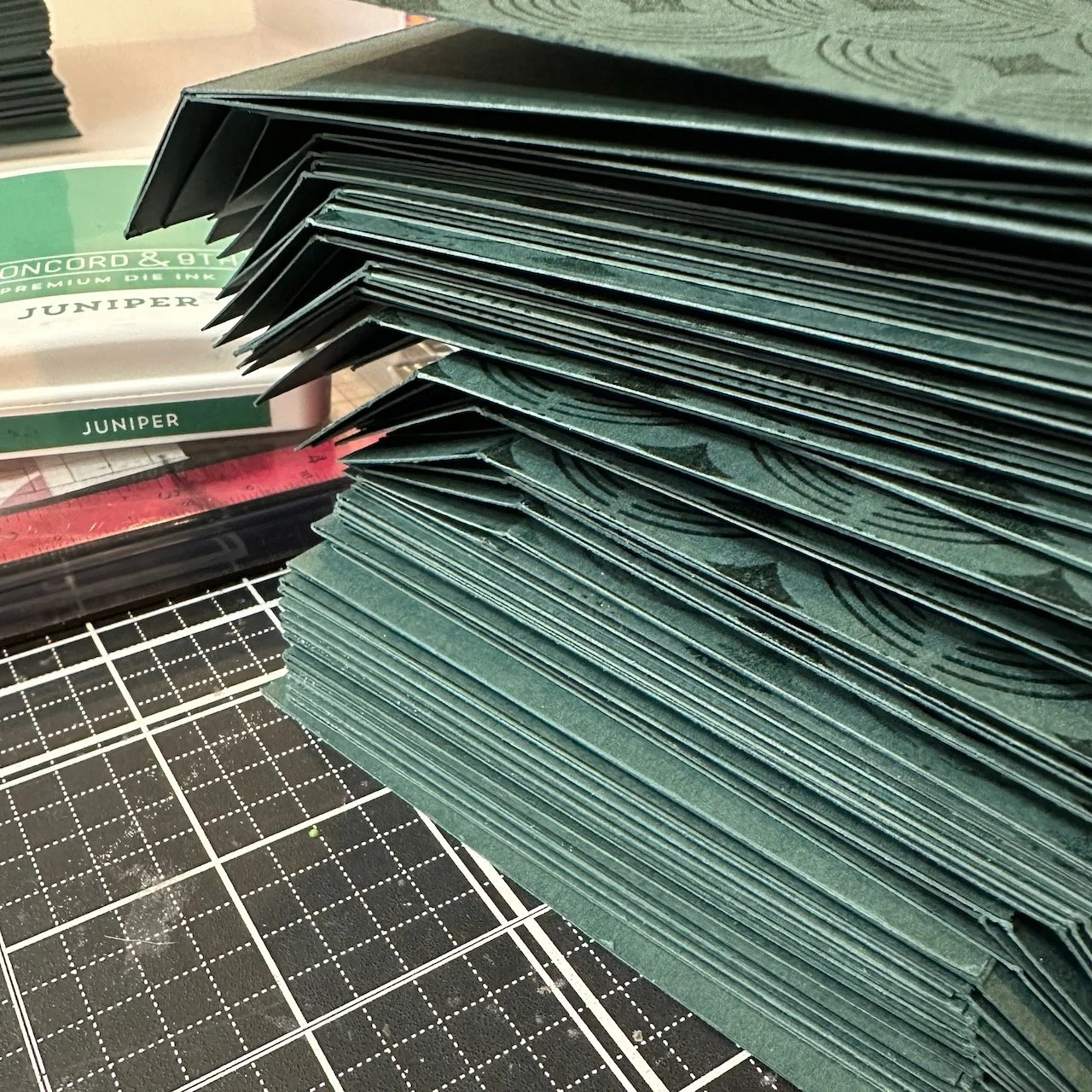
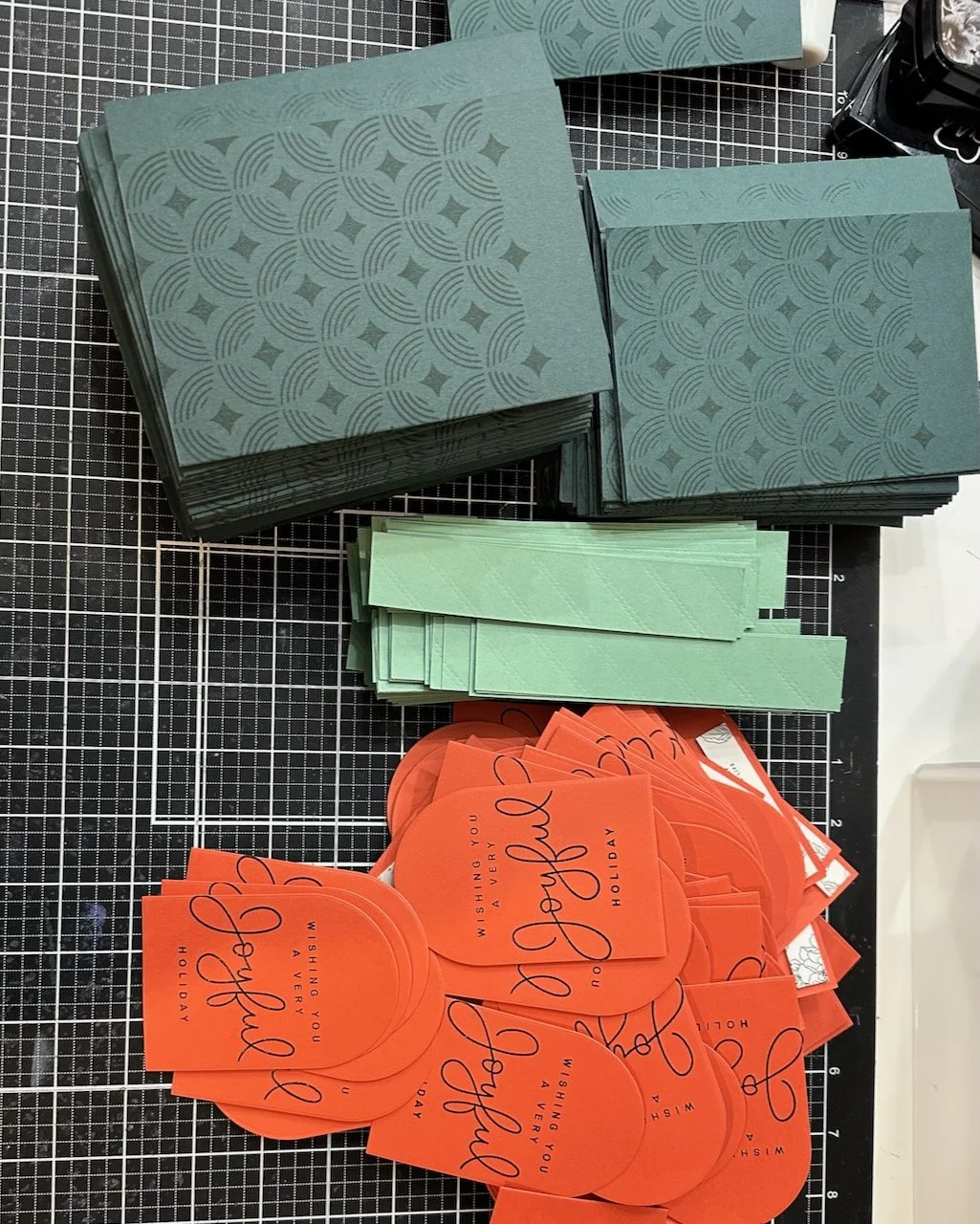
The card base is Rainforest cardstock, from Concord & 9th. I scored those in two spots to create the fold and dimensions I wanted.
I stamped the Deco Star background stamp on one side of the folded base. I positioned it to not cover the whole panel because I liked the way it used the space and this allowed the shaped edge of the pattern to stand out more. Using Juniper ink gave a tone-on-tone effect that provided just enough contrast.
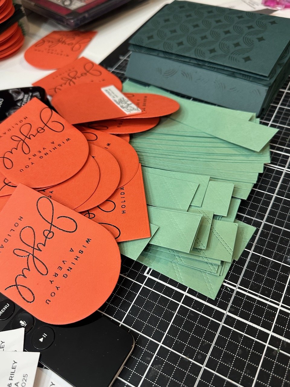
On the left side (front of the hinge trim) is a strip of Eucalyptus cardstock with a diagonal texture. I created this with a cover die on an A2 piece of cardstock, and then cut that into vertical quarter-width strips. I glued that to the front of the hinge piece.
The greeting on the front is stamped in black in and embossed with clear embossing powder. That adds some shine to the card and makes the black appear more saturated—offering additional contrast against the orange.
I die cut the stamped panel with the arch dies, and attached those to each card with foam tape to the hinge side. Using the foam tape both adds interest with the dimension, and also allows the flap on the other side to open more easily.
Inside the card, I attached a photo grid and feature image that included some text and the date also.
Colors:
cardstock: Concord & 9th Pimento, Raiforest, Eucalyptus.
ink: Concord & 9th Juniper. Versafine Clair Nocturne.
Here are a few pictures from my planning and production process.

I usually say I’m going to start earlier next year. I really need to. Once again, December got VERY busy and I really pushed this to the last minute this time, but I got them done!
Thank you for visiting! I hope you get some time to create something soon.
Links are below if you’re interested in any of the products I used.
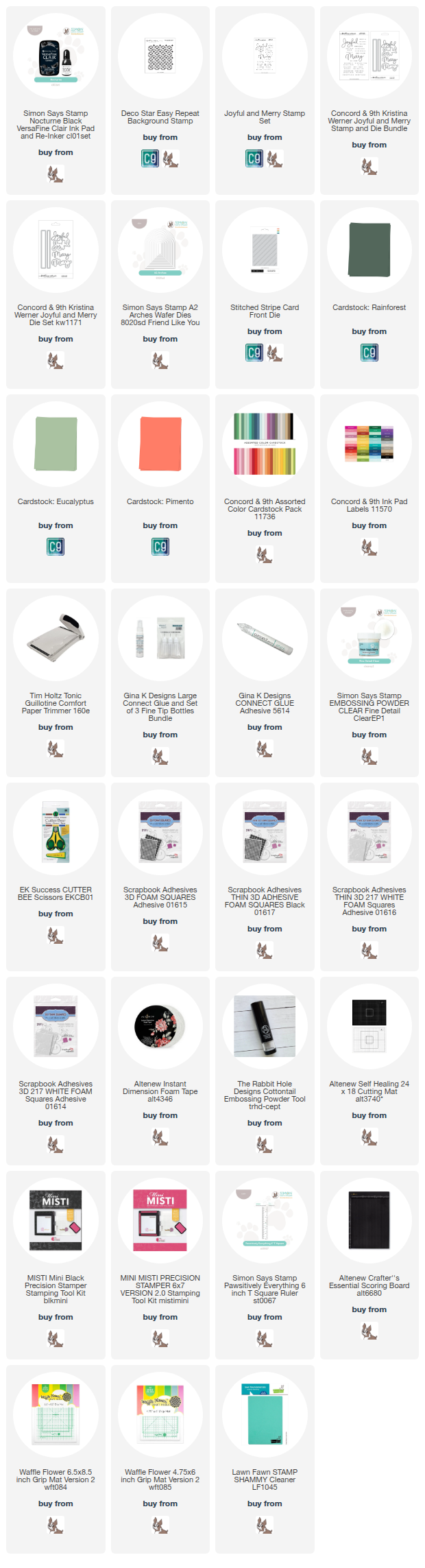
*Affiliate links do not cost you any more when you shop, but it is beneficial to creators when you use them, so thanks in advance!