Pattern + Sentiment + Color
Simple cards with big heart.
One thing I love about Kristina’s stencils (beyond the designs themselves, of course) is that she’s. designed them to be large enough to cover a 5x7, or to create two A2 panels from. It feels like such a time saver, and also gives me an easy way to try more design possibilities for each color combination I stencil.
I realized I had some stenciled pattern pieces sitting on my table, so I paired them with some coordinating cardstock colors and some well designed — and meaningful — greetings for a couple of quick cards.

Techniques:
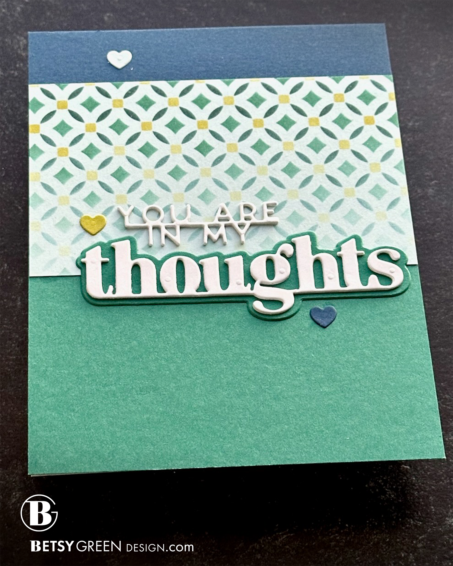
This card began with a stenciled pattern that I’d faded out toward one side. I cut it down to fit across most of the top half of an A2 card panel.
I pulled two coordinating colors of cardstock to use with it, and added a Midnight blue strip at the top, and Juiper green color on the lower section.
The sentiments are all cut from white, and stacked for dimension. I cut the shadow layer for “thoughts” from Juniper cardstock to match the background because I wanted it to stand out well against the stenciled layer behind it.
As a final touch, I added in three small hearts from the colors already used, and placed them on backgrounds that create good contrast with the heart color. They add flow and color balance to the card.
Colors:
cardstock: Concord & 9th Lemongrass, Juniper, Midnight.
ink: Concord & 9th Lemongrass, Juniper, Rainforest.

Techniques:
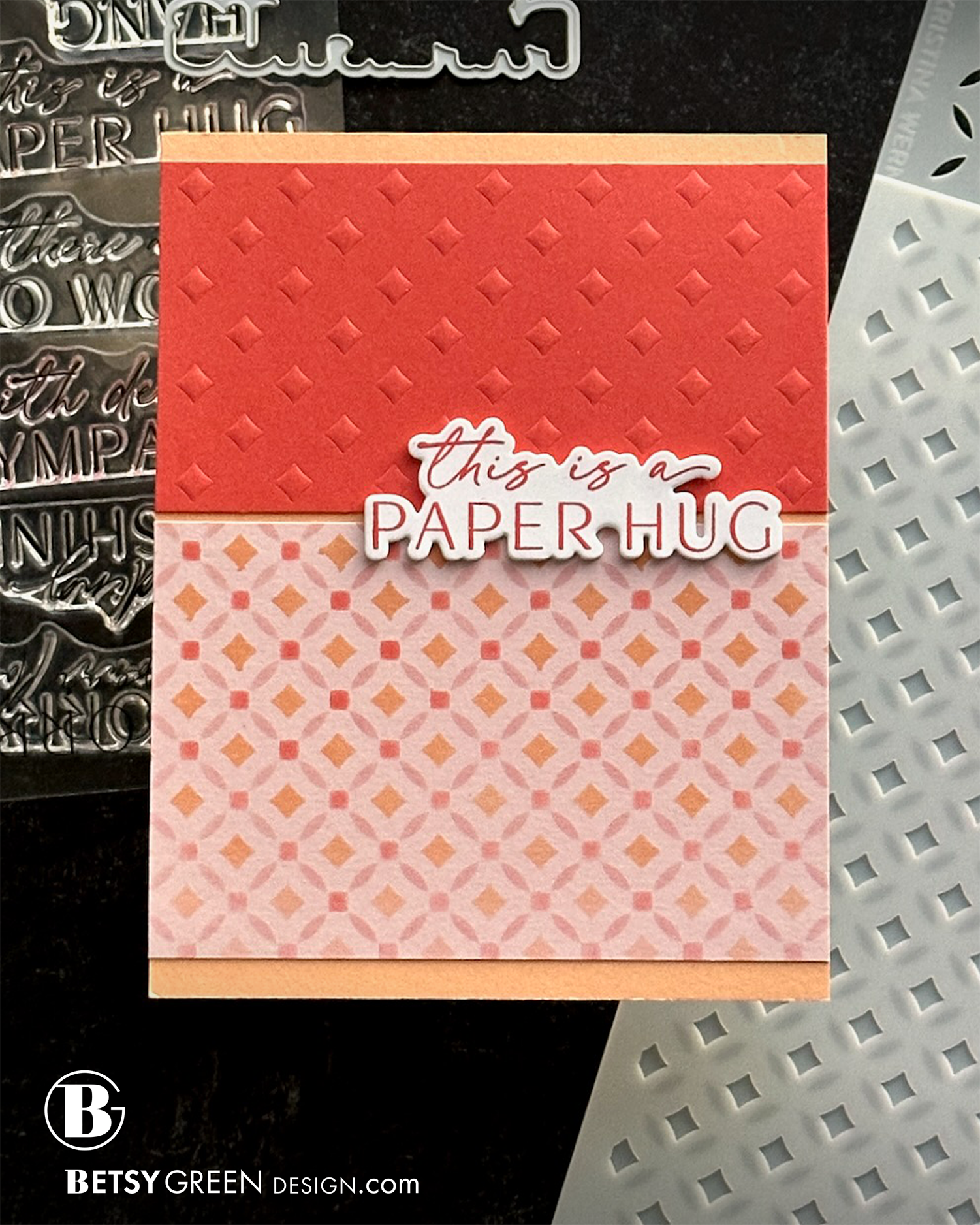
This card uses a stenciled piece that was done with a trio of warm colors on light pink cardstock. Using a colored background instead of white changes the look of the stenciling.
To repeat the feel of the stencil without actually doing the same thing, I dry embossed a piece of Pimento cardstock with the diamond stencil from the Florence Stencils and my Platinum 6 die cut machine. (I use the rubber mat for this technique.)
Layering both of those pieces on a background in another color (from this analogous grouping), but within the same color grouping and of similar value, allows the sentiment that is stamped on white to really stand out against the background.
Colors:
cardstock: Concord & 9th Pink Lemonade, Pimento, Creamsicle. White.
ink: Concord & 9th Carnation, Pimento, Creamsicle.
Thank you for visiting! I hope you get some time to create something soon.
Links are below if you’re interested in any of the products I used.

*Affiliate links do not cost you any more when you shop, but it is beneficial to creators when you use them, so thanks in advance!