Bold Shapes & Bright Smiles
December Release from Concord & 9th
Hooray! It is time for a new release! This is a very fun one, with expanding cards, cute designs, sweet graphics, and a great pattern inlay die. It is perfect for sharing a handmade smile in these winter months.
These two cards both share use of the new inlay die as background (though used differently), and the same core color palette.

Techniques:
I combined the die cut fish (there are also stencils you can use to create fish) with the Hexie Bloom Inlay Die, imagining the die background as water.
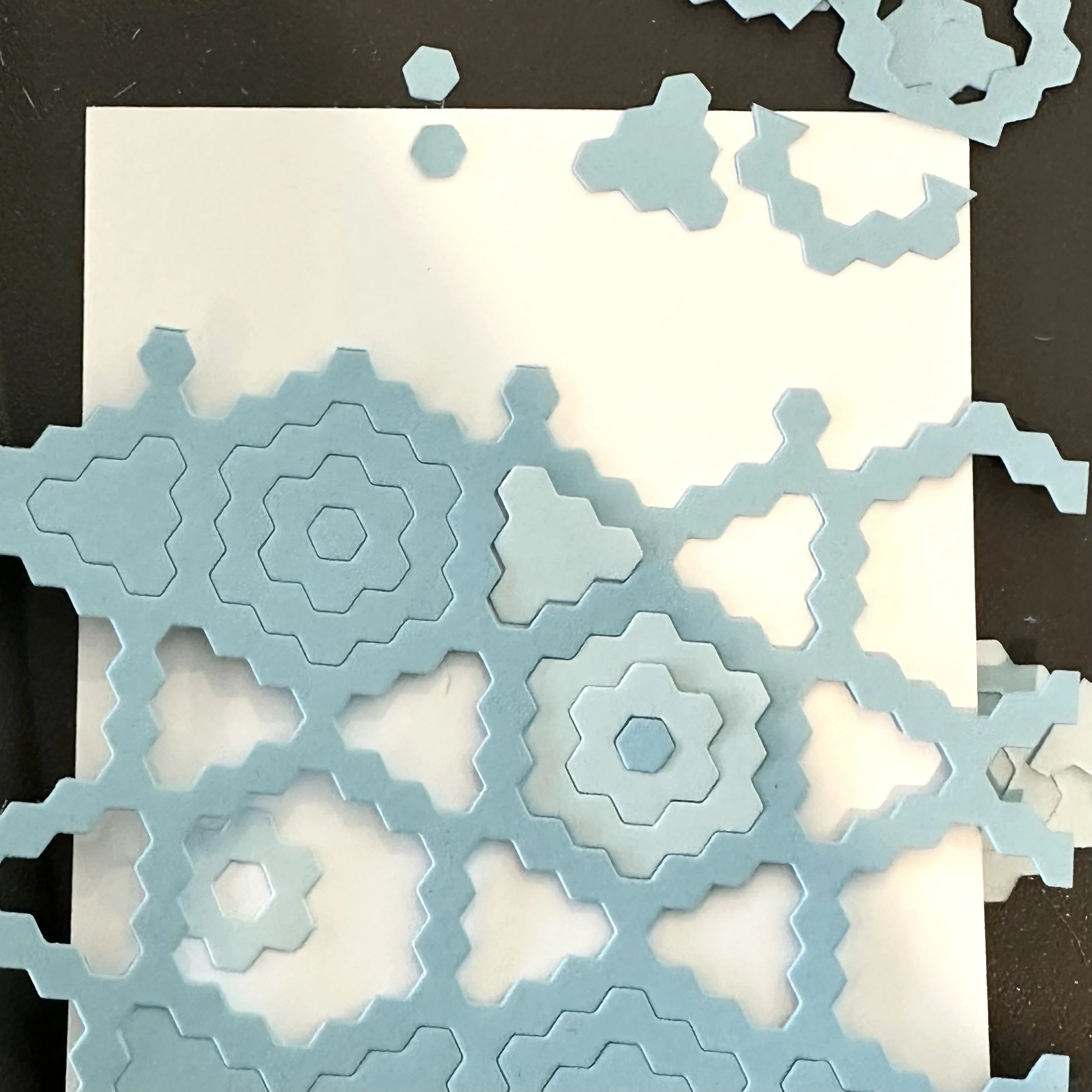
I turned the inlay die cut on its side, and main frame piece left an irregular edge, as you can see in the image here.
Trimming off the three single hex bits that stuck up left it as a more wavy edge, which you can see when you look at the finished card image above.
I cut the die out of Aqua Sky and Powder also, to go with the main Harbor piece. I thought the three would mix well to create the water look, without creating too much contrast.
I created the fish using the same colors that I had picked out for my other card (see card 2) and added in Blueberry for contrast.
Because I wanted the fish at the top to be facing the sentiment, pointing right instead of left, I flipped the head piece over and used the reverse side of the die cut. The other pieces all worked fine, just rotated 180° from the intended orientation. (To minimize it looking like the back side, I used my bone folder to rub down the edges. I think it works!)
I attached both fish with foam tape so they’d stand out and add some dimension.
Colors:
cardstock: Concord & 9th Pimento, Sorbet, Honeycomb, Blueberry, Aqua Sky, Harbor, Powder. White.
ink: Black.


Techniques:
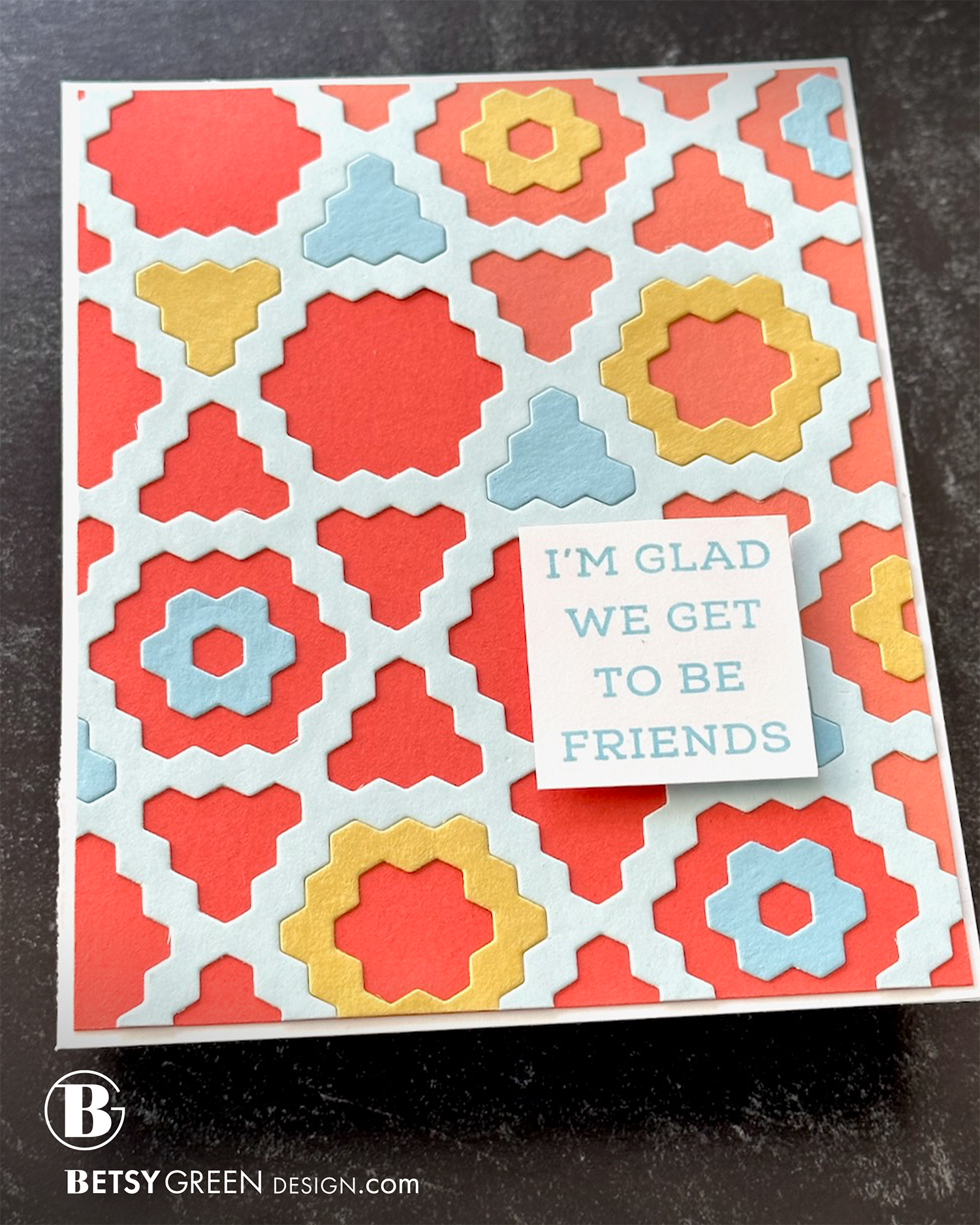
For this card, I used just the Hexie Bloom Inlay Die and played around with color and pattern. I wanted to highlight the open spaces, so placed the Powder frame piece on an almost complementary background.
I created the background with two adjacent colors in the Concord & 9th color spectrum: Pimento and Sorbet. I placed the seam along an angle that lines up with the frame shape, and gave the colors a kind of 70-30% ratio.
Continuing with some of the same colors from the previous card, I filled some of the spaces with Harbor and Honeycomb, taking care to create some asymmetrical balance with color and shape.
Colors:
cardstock: Concord & 9th Pimento, Sorbet, Honeycomb, Harbor, Powder. White.
ink: Concord & 9th Harbor.
Thank you for visiting! I hope you get some time to create something soon.
Links are below if you’re interested in any of the products I used.
*Affiliate links do not cost you any more when you shop, but it is beneficial to creators when you use them, so thanks in advance!