Creating Fun with an Unexpected Theme
January Release from Concord & 9th
When I got the January 2026 release from Concord & 9th I was NOT expecting to see a bundle of product with fuel pumps. For cards?? But…they are Concord & 9th and create some of the most fun die sets. Who knew that creating with fuel pump dies would be so fun? These are some cute fuel pumps! (I never would have guessed I’d say that.)
I’m enjoying the vintage style they gave them, and the rounded casual but geometric-based shapes.

Techniques:
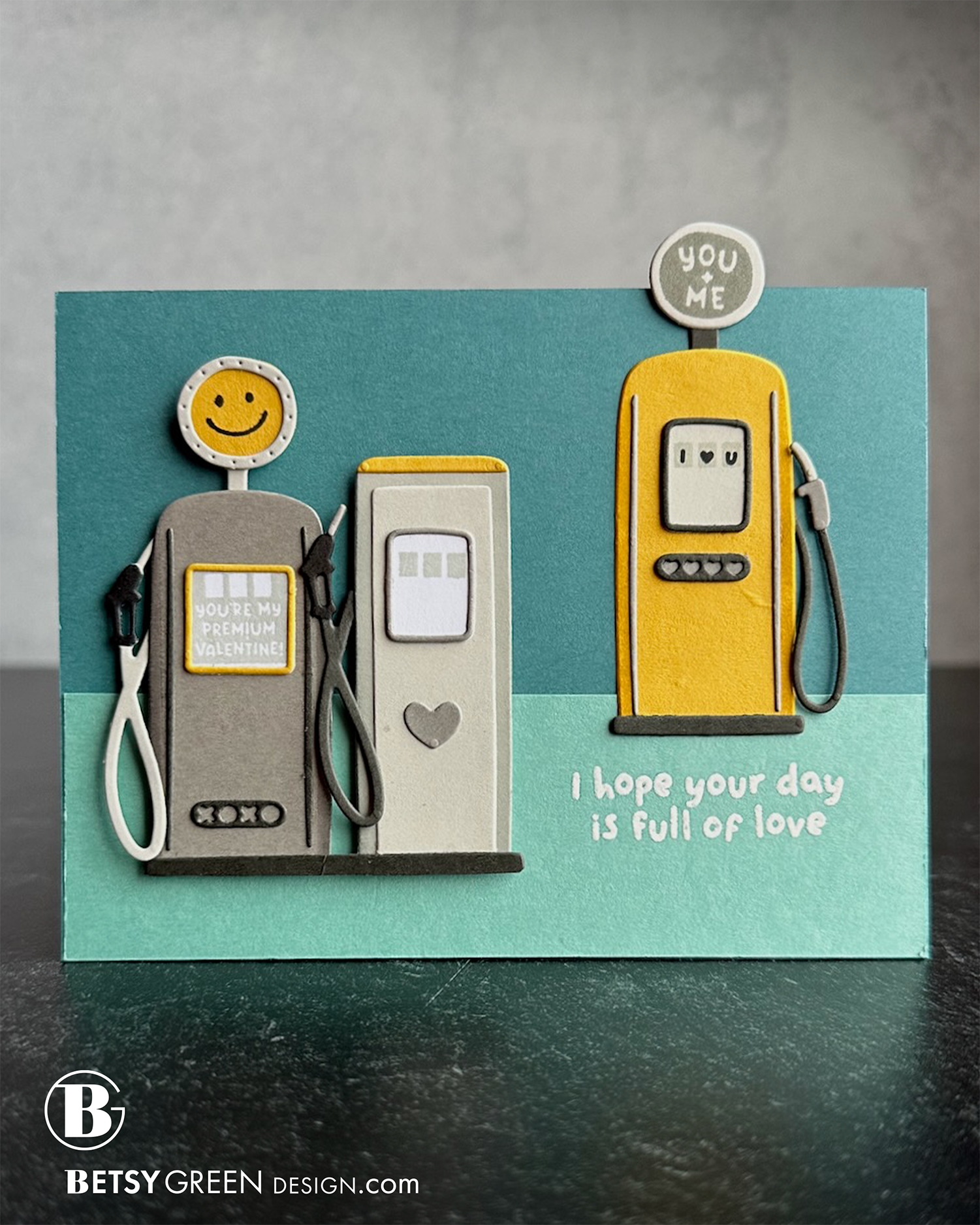
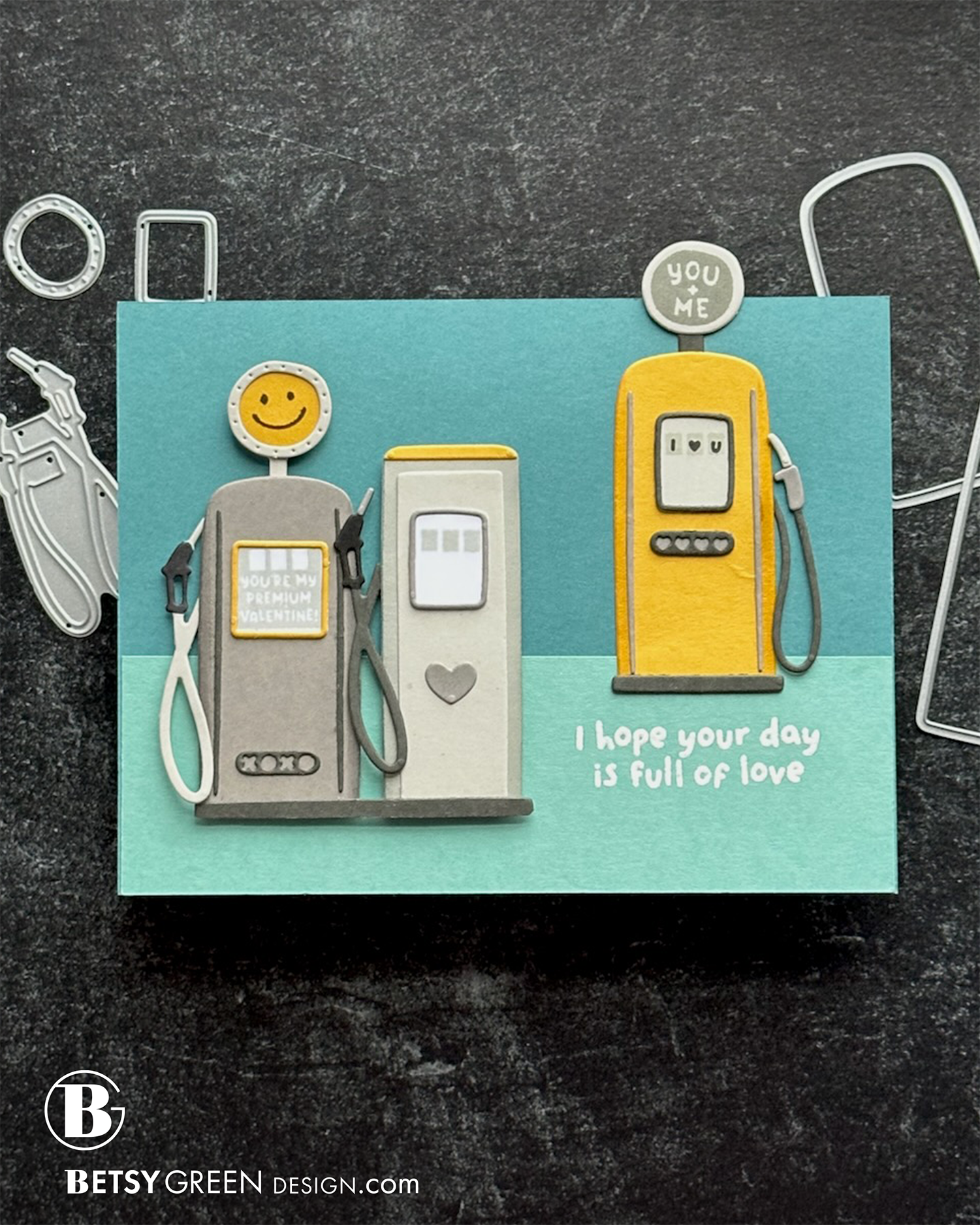
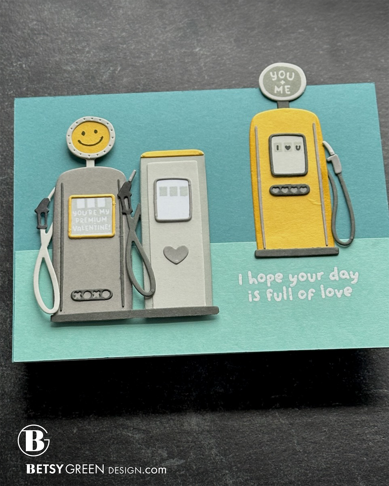
Aren’t these really the cutest fuel pumps? Wow. I started with a color palette that fits the vintage feel of these dies.
I chose to stick mostly with grays for the pumps, and to use the yellow as detail - and for the focal point pup that leads to the greeting.
For the background, I chose a cool color pair that allowed both the yellow and the grays to show up well. Splitting the background vertically between the two colors creates a horizon line and grounds the fuel pumps.
1/16” foam tape behind the two gray fuel pumps adds dimension and helps those seem for forward in the scene (like the rows of pumps as a gas station), even though the scale is the same as the yellow one.
The stamp set has some sweet little details, and really good pun greetings.
Colors:
cardstock: Concord & 9th Sunflower, Tidepool, Lakefront, Mushroom, Cobblestone, and Pebble. White.
ink: Pebble, Black.
Techniques:
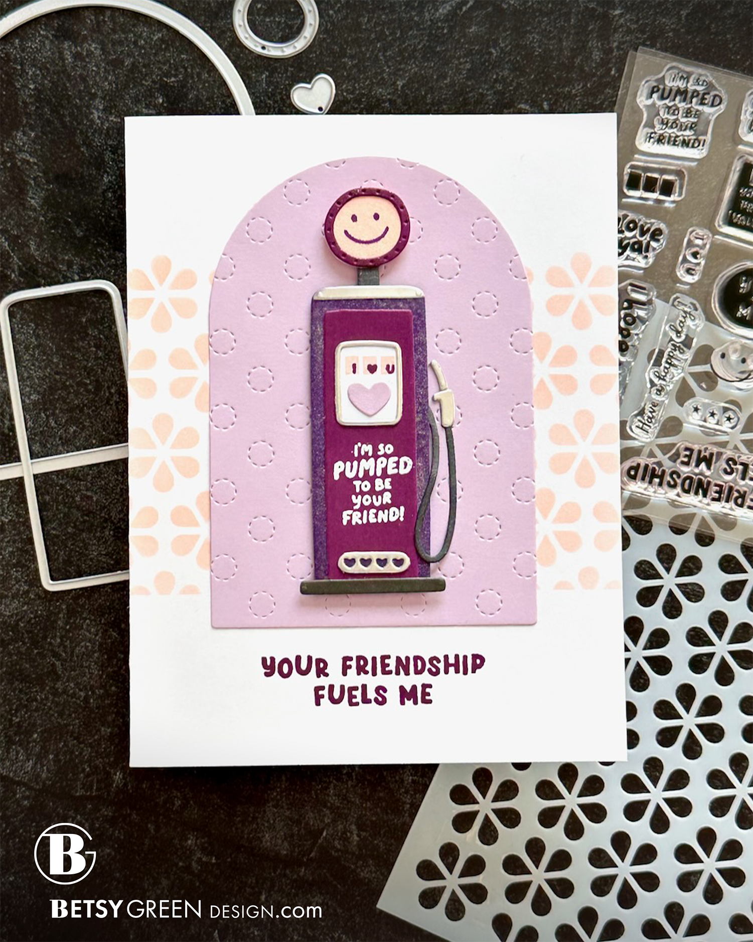
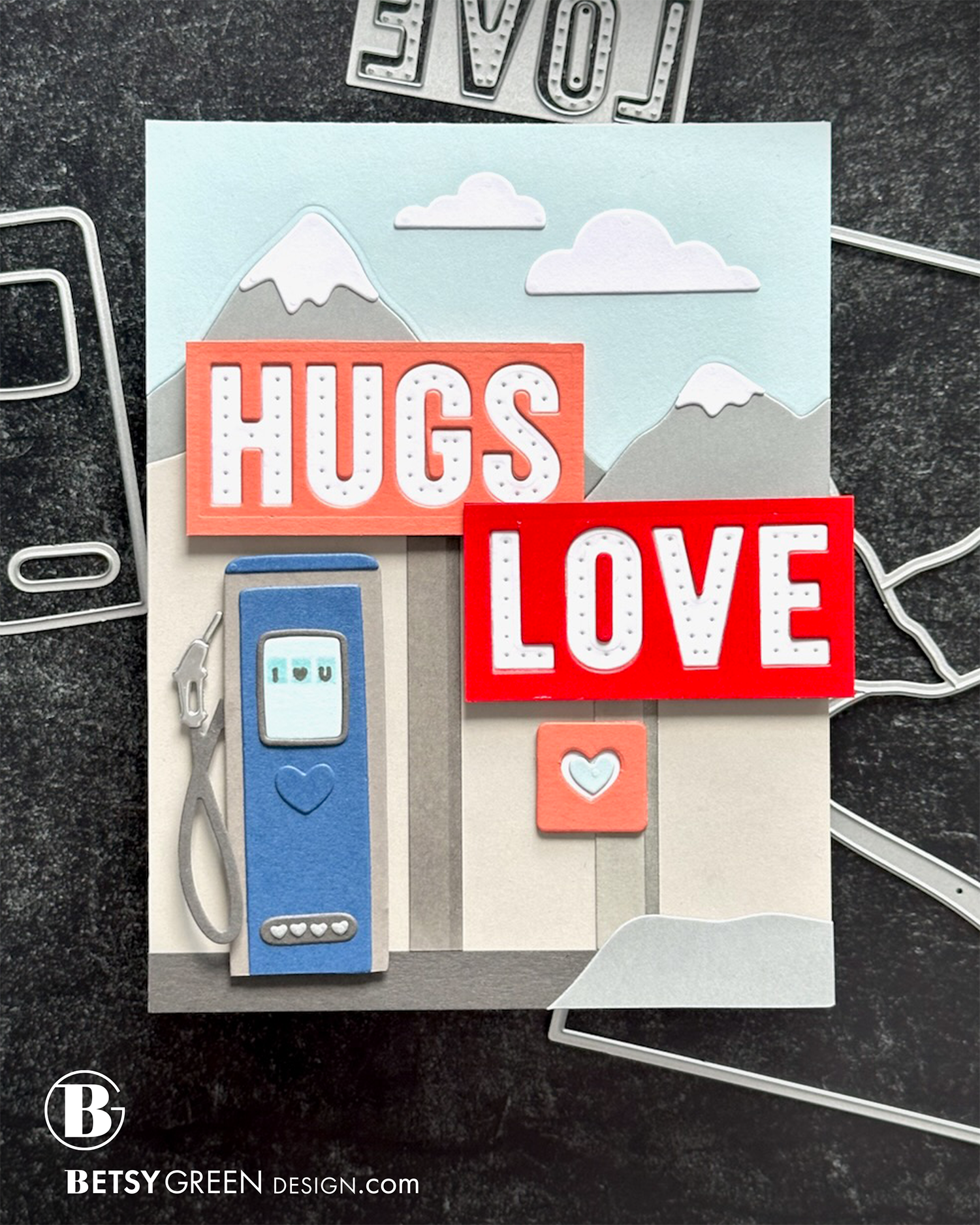
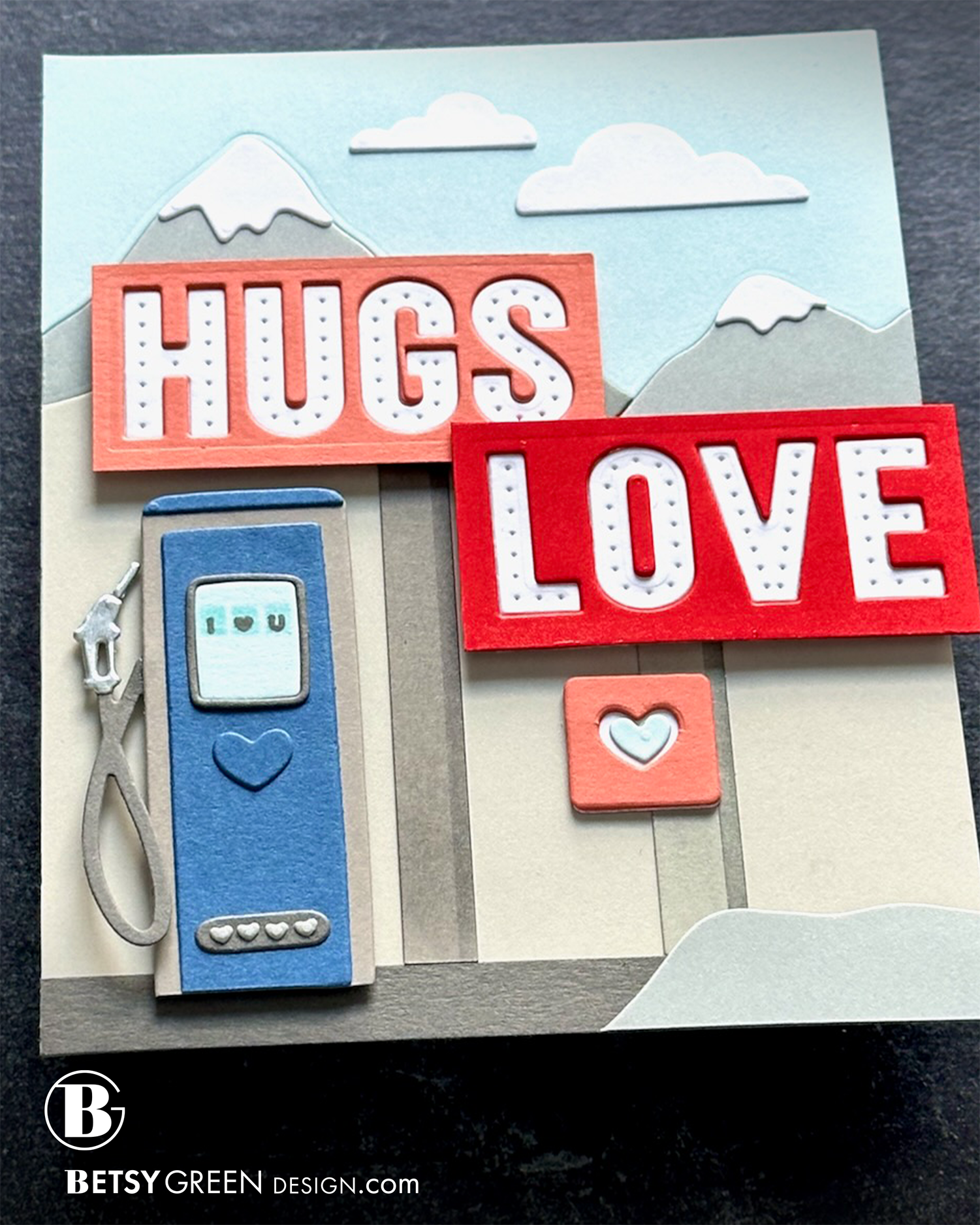
Sometimes, seeing products simply near each other gives me ideas. The words from the Stitch of Love Piercing dies made me think of billboards and other tall signs you see along the interstate or on a road trip. So, combining those with a fuel pump created that scene.
I used bright warm color on the signs to establish those as the focal point of the card. Instead of stitching the letters, I used them with just the piercing because they made me think of the pattern that bulbs created in old signs—like marquee signs.
By stacking up the frame of the sign, and inlaying the letters, it created the feeling they were contained.
To create the sign shapes I just cut out the dies for the letters, and then trimmed around it with my paper trimmer. I actually stacked up a couple of layers of the colored cardstock, and then trimmed them out.
I created the pump in a simple combination of blues and grays since it has a supporting role in this layout. The pump and the background are both in blues and grays only, with the only white and true warm colors on the signs.
Since Concord & 9th is based on Salt Lake City, a mountain background felt appropriate. I used the main cover die from the Alpine Village dies and just cut the top portion of it to get what I needed.
The rock in the lower right corner is an extra piece from the cover die. I angled and trimmed it there to add a little bit of visual balance so that corner didn’t feel empty, but with the subtle color variation the low contrast doesn’t challenge the main focal area with the signs.
Colors:
cardstock: Concord & 9th Poppy, Sorbet, Blueberry, Powder, Mushroom, Cobblestone, Dove, Pebble. White.
ink: Concord & 9th Powder and Mushroom.
coming soon!
Thank you for visiting! I hope you get some time to create something soon.
Links are below if you’re interested in any of the products I used.

*Affiliate links do not cost you any more when you shop, but it is beneficial to creators when you use them, so thanks in advance!