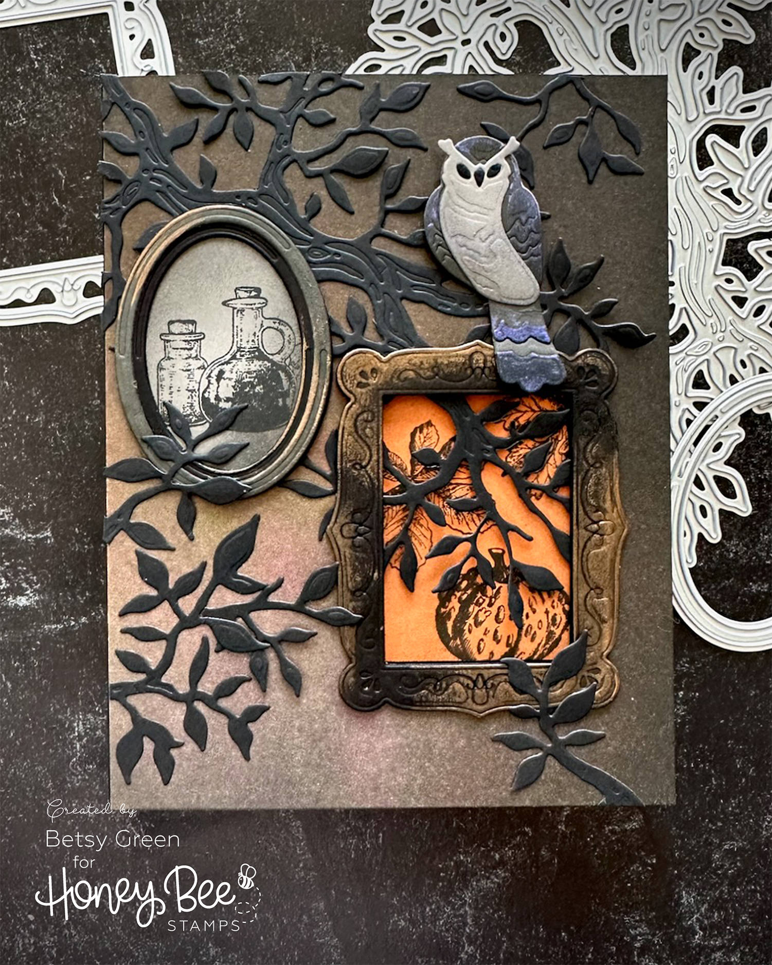
Spooky Frames
I think one of the fun ways to make seasonal or holiday cards is to put a spin on “regular” products to give them that feel or mood. I did just that on this card for a friend that features some products from the current Honey Bee Stamps Hello Harvest release.
Techniques:
For this one, I had the idea to turn the Gallery Frames and Wall Art into something a little more spooky. Think Haunted Mansion, if you’ve been to the Disney parks, but in a more simple way. I thought the traditional style and details of the frames would lend themselves well to this.
I cut the frames out of black and Mushroom (charcoal gray) cardstock and layered a couple of base ones to give them thickness.
I added some metallic paste to the top detail layer, using my finger so it has an imperfect application. I was going for an aged look, more than a perfect metallic frame. The Refined Copper Lunar Paste has that orange-ish color that worked well for this spooky scene, and coordinates with the background paper.
I selected a patterned paper from the Homestead Harvest paper pad to use as a background. It is actually created to work well with the coffee themed products in the release, but the brown and slightly patterned background felt perfect for this scene.
Next I determined my layout, and where I wanted the rectangular frame to be, and I used a die to cut that window into the card front and added that onto a folded black card base.
To add some texture, pattern, and spooky feel to my scene, I used the branch die from the Window Fall Add-On. By cutting the branch out of black it has the dark and creepy mood I wanted. I made sure that part of the branch covered part of that window I’d cut in the card front. Layering some of the branches over the frames - and behind/through one - also gives it a bit of creeping effect, as if it might take over the scene.
I love adding extra interactive elements to my card, and having that window with the branch through it where you can peek at what’s inside but not see it clearly is a detail that makes the card so much more engaging, even with all the other layers and details here.

The Gallery Wall stamped images are just stamped with black ink on colored cardstock, but I also did some ink blending around them.
I applied the main branch to the card front, then layered in the frames. After those were glued on, I added some additional bits of branches overlapping the frames.
I also added a single layer of black frame inside the card, just to finish off that side.
The owl is die cut from Pebble and Mushroom cardstock. I added some ink blending to it with grays, and then added some Royal Flush Solar Paste for a subtle touch of purple. I really like the Solar Paste because the color is subtle, and shows more or less depending on the light.
Colors:
cardstock: Concord & 9th Spiced Cider, Mushroom, and Pebble.
ink: Concord & 9th Spiced Cider, Mushroom, Pebble, and Black. Versafine Clair Nocturne.


Thank you for visiting! I hope you get some time to create something soon.
Links are below if you’re interested in any of the products I used.
*Affiliate links do not cost you any more when you shop, but it is beneficial to creators when you use them, so thanks in advance!