
Clouds - with Something Extra
Featuring some stencils and dies from the Waffle Flower August Release
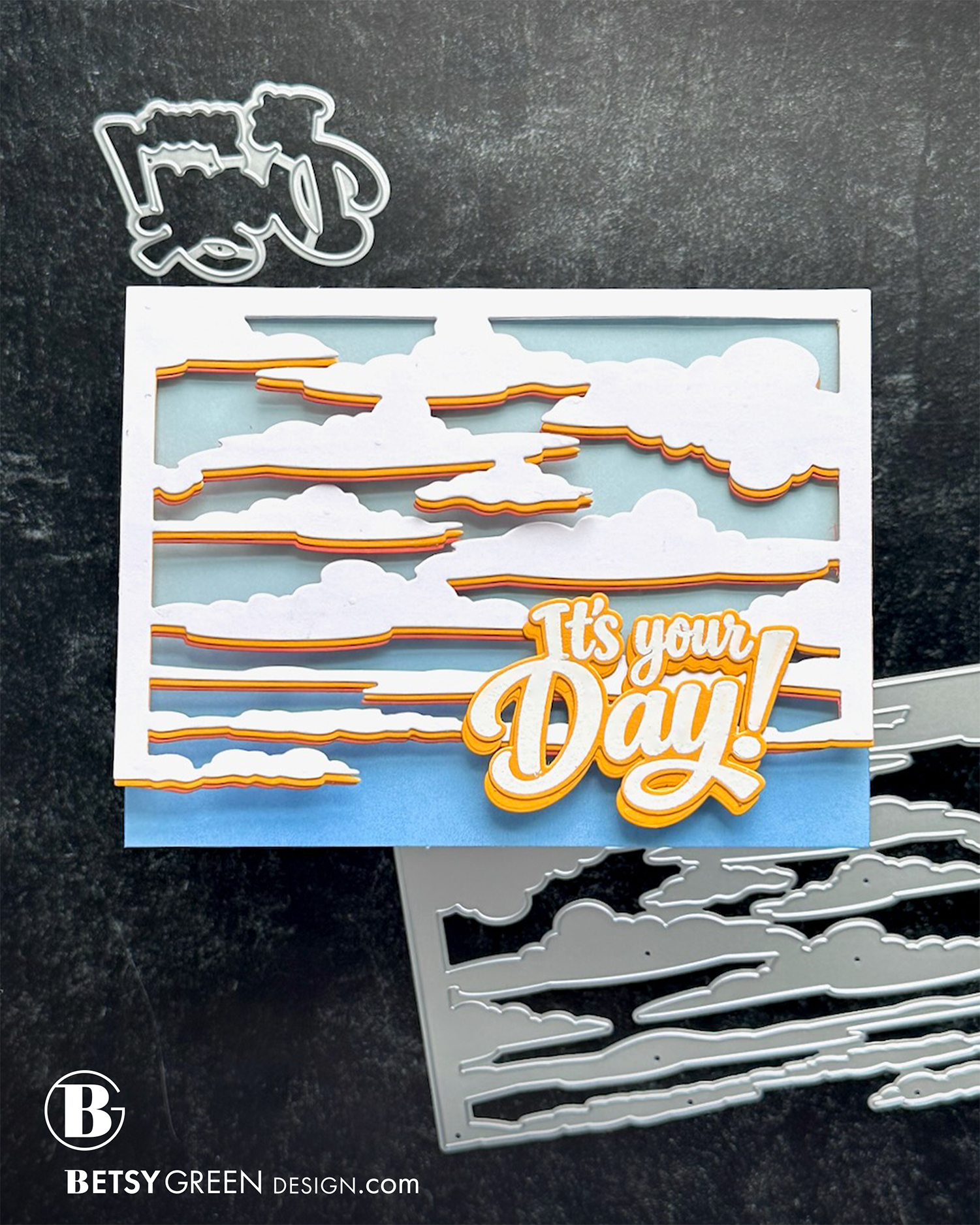
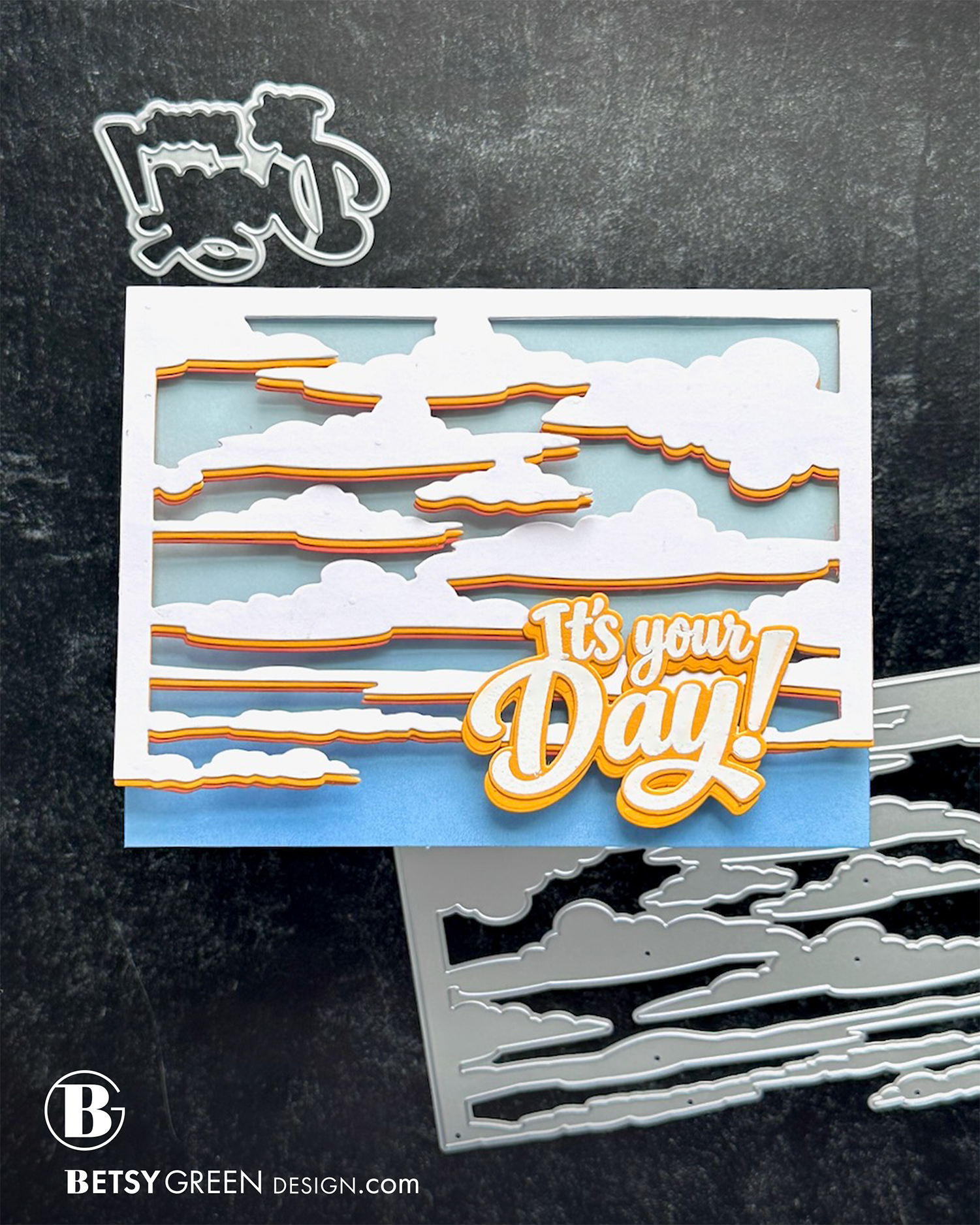
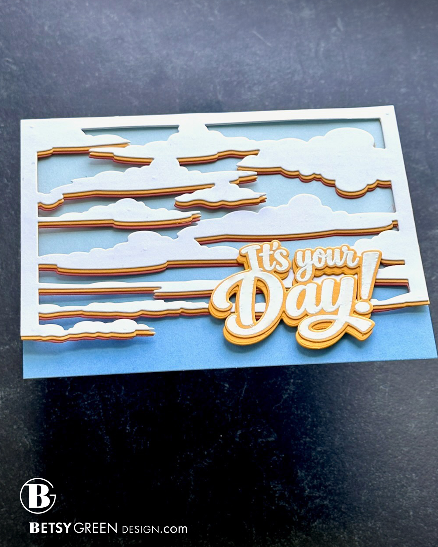
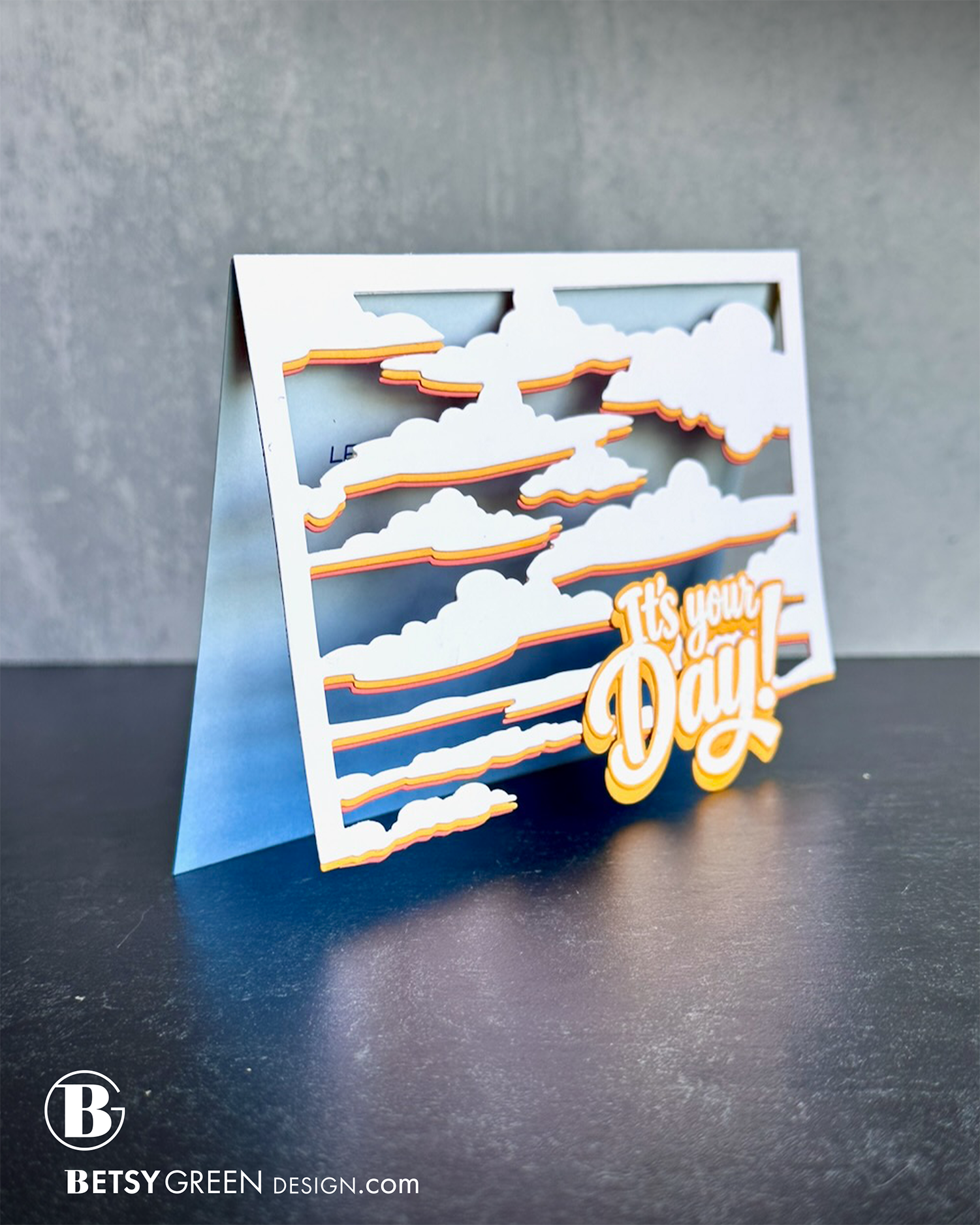
Stacking two die cuts that are identical except for color can create a very cool effect when you offset them. Think of it like creating shadow - you can do it with a darker shade/color of the one that’s in front, or you can do it with a totally different color.
Play with how much of the back layer you let show, and which side(s) it shows on. It can completely change the effect. I always play with the layers and move them around to figure out what I want before adding adhesive.
For this card, I wanted to create a sunset, but loved this cloud die and wanted to see if I could figure out a way to create a sunset feel with the die instead of an ink blended background like I was tempted to do.
I don’t see this as a full sunset, because there’s just a hint of the colors, but more like the early morning as the sunrise color fades, or in the evening before it sets and you start to get a bit of that color shift, even if just in anticipation.
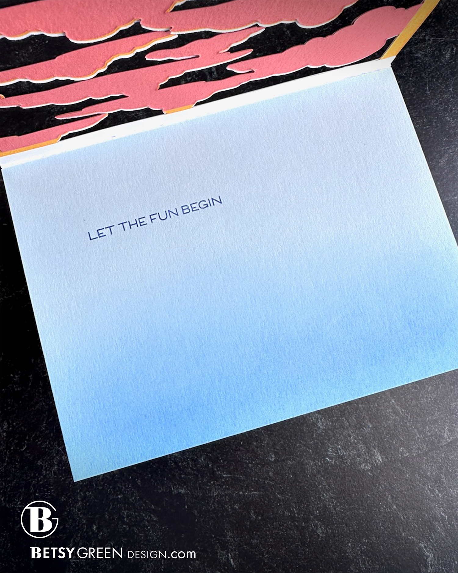
I did ink blend the light blue background to get darker at the bottom, simply to provide the contrast I wanted to be sure my greeting stood out. (In my mind, making cards is not about creating an exact visual representation of the real thing, such as a sunset or sunrise, but more about creating enough of the mood or feel so it feels meaningful to our brains.)
There is a larger amount of the shadow layer showing behind the greeting, because I wanted to give it a bigger colored space around it to help the white embossed words stand out from the clouds. How it works matters more than if it all matches perfectly.
Products Used:
• Cloud Background Die (I cut and layered it in three colors)
• Your Day Sentiment Stamps and Dies
Colors:
cardstock: Concord & 9th Sorbet, Powder. Spellbinders Saffron.
ink: Concord & 9th Harbor, Capri.
Techniques:
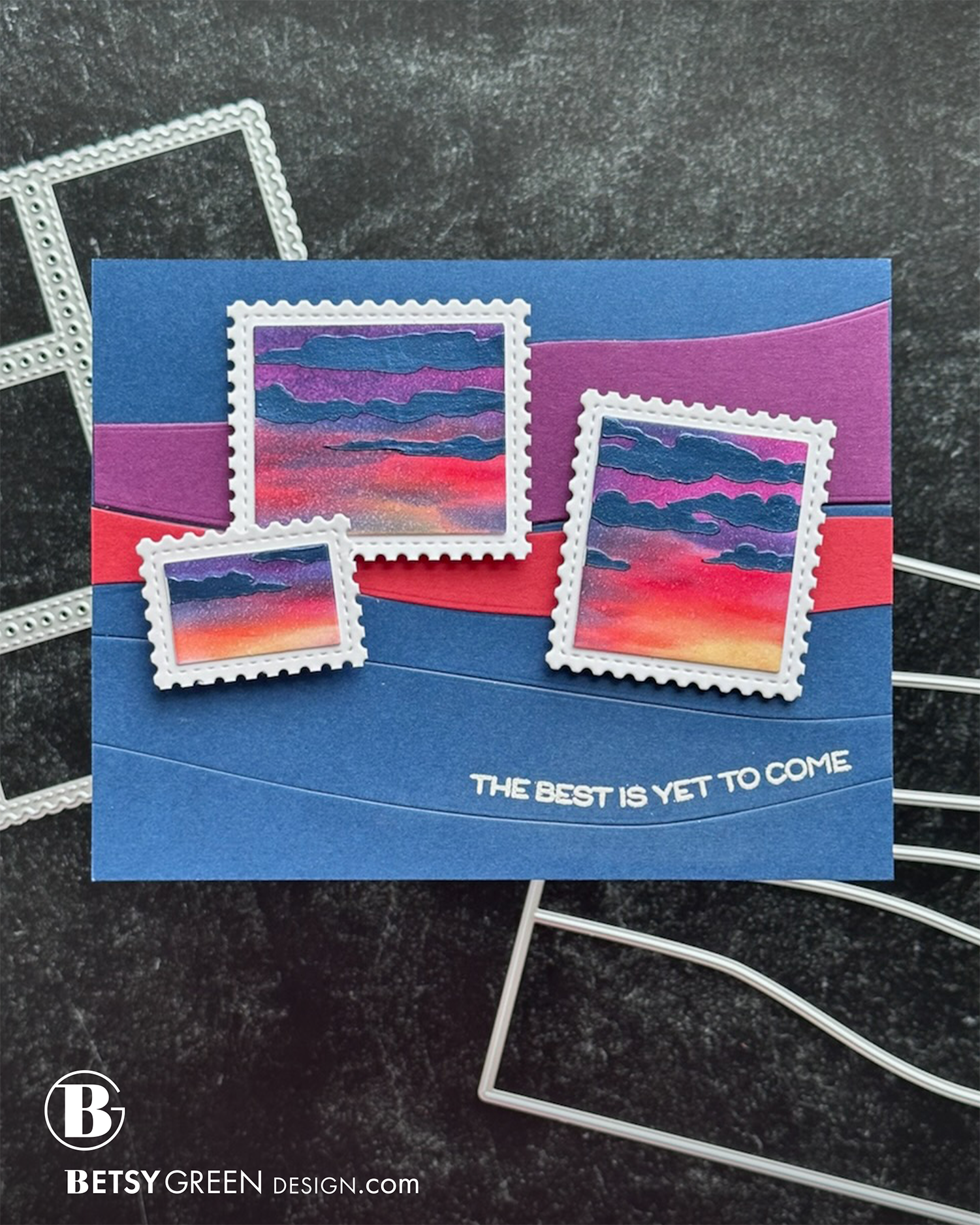
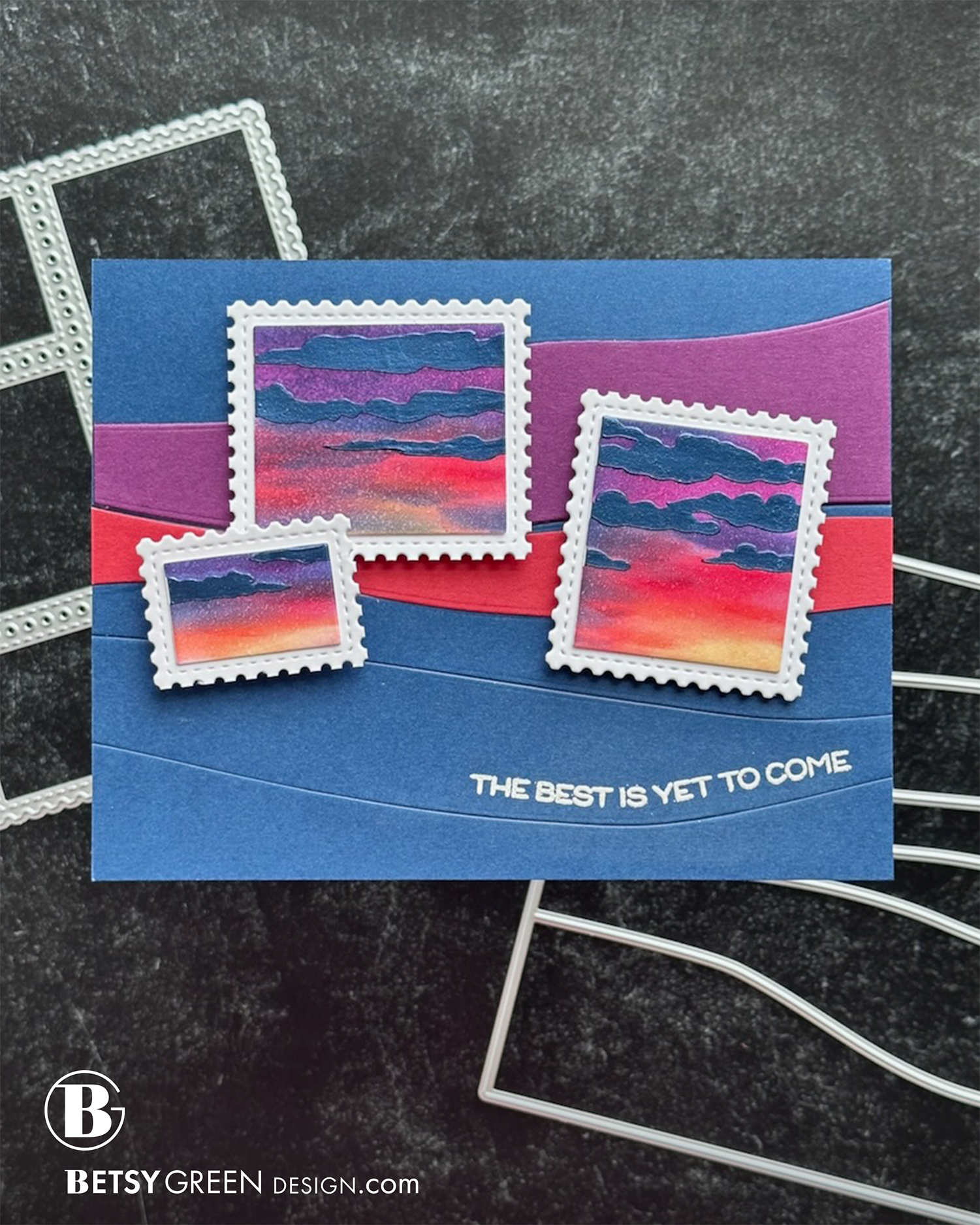
This time I used a stencil, and actually did create a sunset with clouds.
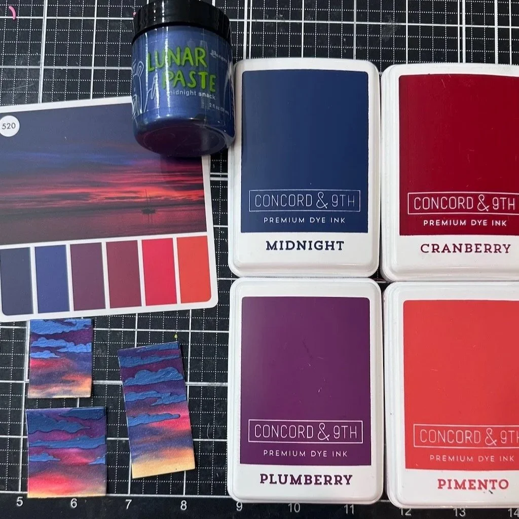
Usually I just pick colors based on an idea in my head, often inspired by something I’ve seen. I didn’t have a strong idea this time, so pulled out a color cube I got a while ago and have only used a time or two. I have Color Cube 3, which happens to have a good sunset section, which gave me a perfect starting point for my colors. (See picture below.)
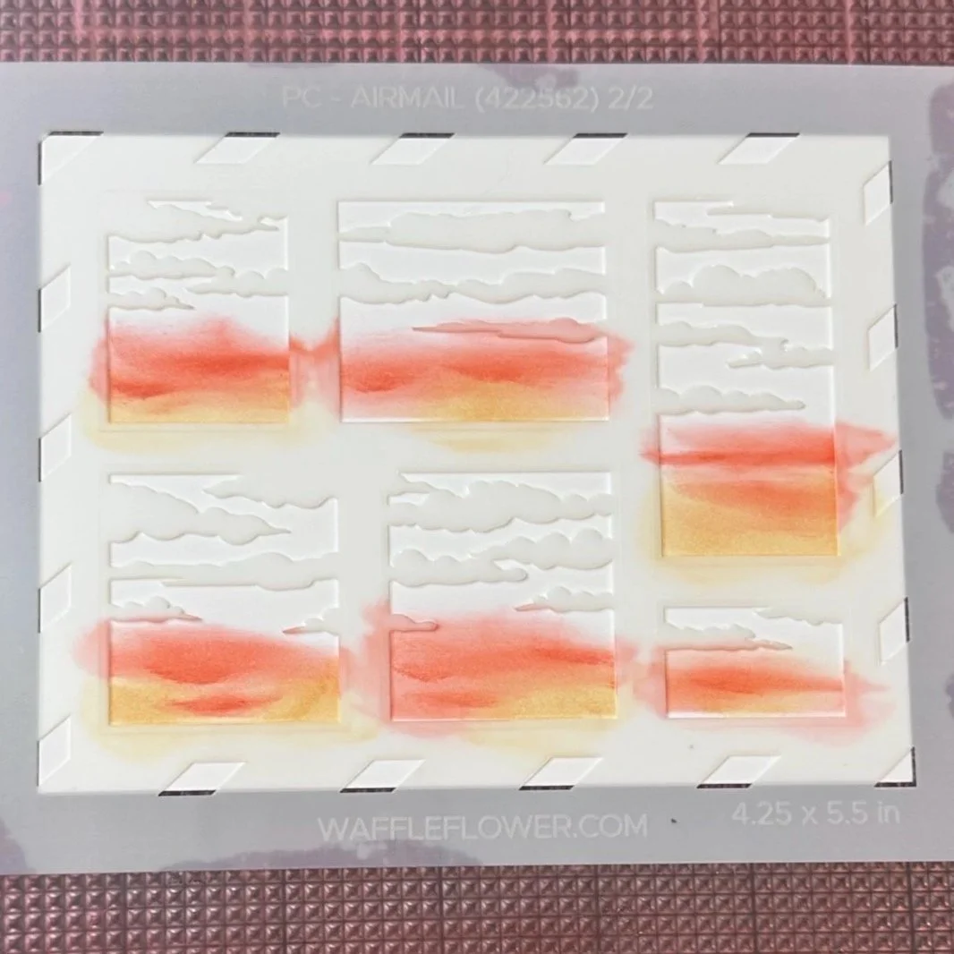
I did ink blending through the sky stencil. I used small blending brushes, and angled them so I could apply small swashes of color.
After ink blending all the sky colors, I gave it a light mist of water to both blend a bit and add a little but of visual texture to it.
Once that stenciled sky layer was dry, I added the clouds with Lunar Paste, and let that dry.
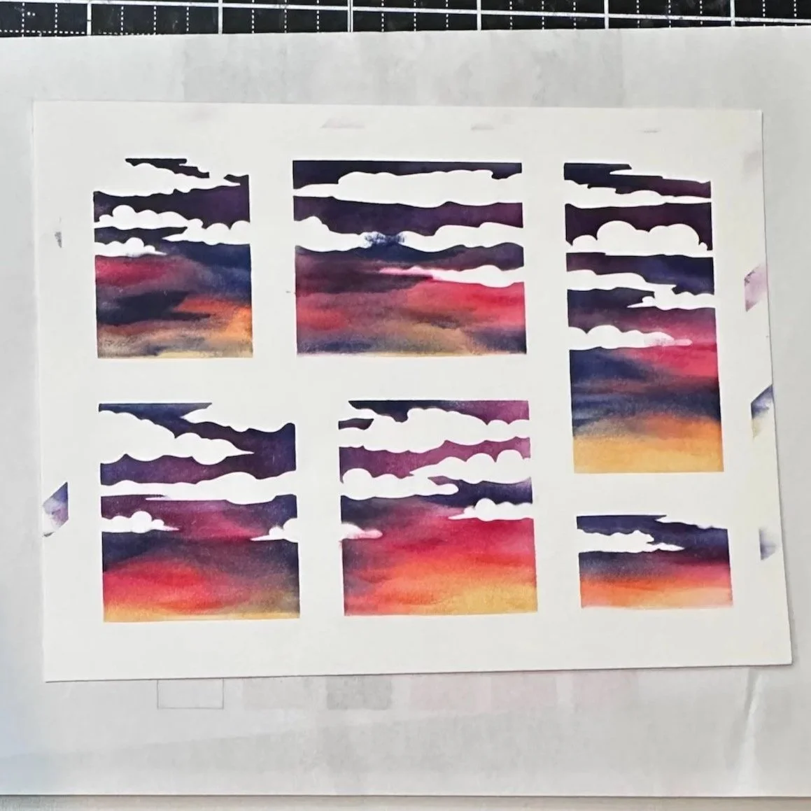
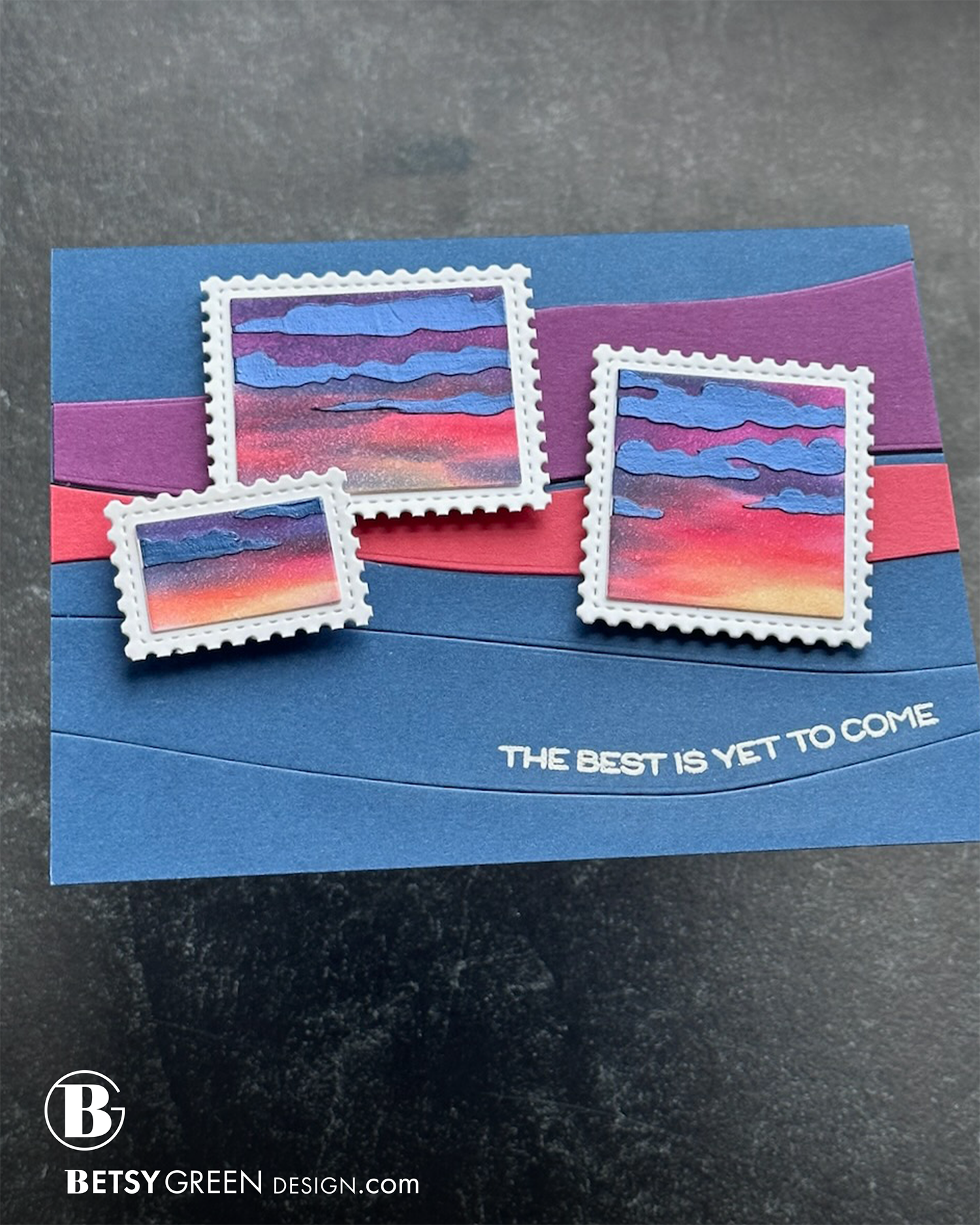
I cut it with the A2 Postage Collage Blocks Die, and added those on top of white postage shapes cut from white cardstock with the A2 Postage Collage Die.
The background was created with the Wavy Lines Horizontal A7 Die. I cut it all out of navy blue, and then also cut two of the waves with a warm purple and a red color that coordinate with my postage sunsets. I did trim the top edge of one of the red wave to create a space between them so the background shows through.
The greeting is white heat embossed on one of the waves. I curved the stamp to follow the wave shape.
Products Used:
Postage Collage Airmail Stencil
Wavy Lines Horizontal A7 Die
Retirement Sentiments Stamp
A2 Postage Collage Blocks Die
A2 Postage Collage Die
Colors:
ink: Concord & 9th Plumberry, Cranberry, Pimento, Sunflower, Midnight.
cardstock: Concord & 9th Plumberry, Brickyard, Midnight.
Thank you for visiting! I hope you get some time to create something soon.
Links are below if you’re interested in any of the products I used.
(Listed by company, with links to Concord & 9th and Simon Says Stamp. *Affiliate links.)
*Affiliate links do not cost you any more when you shop, but it is beneficial to creators when you use them, so thanks in advance!